Kandinsky (the Guggenheim)
I like Kandinsky but it's difficult to write too thoroughly about his work because his abstractions are hard to distinguish by words. His work is less about analysis and more about the instant sensation. I can't remember many of these pieces just by what I wrote about them, but I know I liked them.
[I'll finish adding links later this week]
Near the beginning of the exhibit the Edwin R. Campbell panels are on display- these pieces, from an interior design commission, are on loan from MOMA, and I've seen them and admired them before. They're the pieces most likely to have been seen before, by the casual NYC museum goer- a clever, warm way of introducing the exhibit.
It's mentioned that Kandinsky sought to find freedom from nature, “as in music”… interesting. True. Music creates sounds and rhythms that exist nowhere else in nature- art meanwhile, so much of it is just a reproduction of what we see. “Music could elicit a response without a recognizable subject”… very well phrased. Why do some arts work in this form and others don't? Abstract theatre, after all, is annoying, and abstract writing seems impossible… some arts, to succeed as art, must demonstrate empathy and reflect on the conditions that humans experience. Others are free to roam. What separates them?
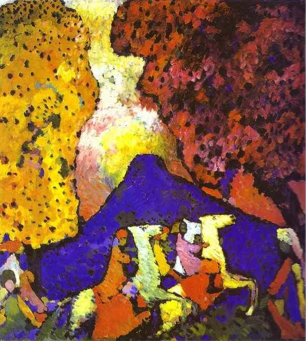
Riding Couple- beautiful; rich dark blues, the glowing Russian city in the background.
A few references to the Fauves- who were they, what is this school?
He was pretty spiritual, I didn't know that.
One of his works from 1908/1909 reminds me of Gaugin (Landscape near Murnau with Locomotive)- big, flat, sweetly simple planes of color.
Blue Mountain… love it. Very pretty one. This looks like a transitional phase between his somewhat more literal early works, and his famed abstracts later on- horses, trees, but big, bright, strange color. “This is the time in art when colors stops being descriptive and becomes more about expressing emotion”- tour guide, overheard. I like that analysis.
The canvases are getting bigger, stranger, more beautiful… I thoroughly like “Improvisation 4”- dark blue and greens rules the middle, a glowing, peach sunset sky on the right.
Picture with an Archeron loan from MOMA, a great one.
Some of the improvisations are a little childlike… they're nice, but the colors seem a little less inspired, the lines a little too foggy… Sure he's experimenting, but I like his busier, more deeply colored pieces.
“Theosophical thought”- I like the expression, I get the gist of this concept, but it would be interesting to look up and read into it.
Impressions, improvisations, and compositions… I like Kandisnky's definitions and I wonder how I could apply them to my own artistic endeavors.
Look up Phalanx artist's association, and Gabrielle Munter. (It's interesting to notice that Kandinsky really began focusing on art in his early 30s, and his breakthroughs came in his 40s…)
I like Improvisation 19, a field of purple and blue, with some red and yellow figures in the lower left. Black lines defining the figures.
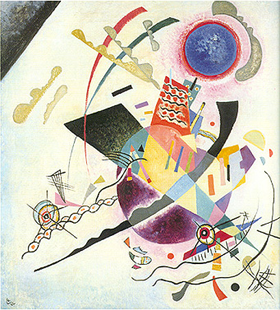
I like Picture with a Circle- before, the colors seemed pretty but a little amateurish, childlike, like's he's figuring it out. This is the first work where the colors truly blend in a beautiful fog. According to the tour guide, “this is the first non objective painting”- ¨no subject at all- Painting with a Black Arch- fantastic as well. Now we're in a Kandinsky phase that I really like, the oily, foggy, dreamlike blend of color.
Improvisation 27 (Garden of Love I)- not super beautiful in the color (yellowish, brownish, with some blue and red) but blended quite beautifully. According to the time line this piece was originally bought by (somebody influential- Alfred Stieglitz, perhaps?)
I Really love Small Pleasures- beautiful color, beautiful blend… 1911-1914, I love these years.
Sketch II for Composition VII (1913)- absolutely beautiful, bright, dreamy color. “Improvisation 35”- beautiful. WOW- black lines, it's like inverse fireworks. Bright, bold spots of color, with an intricate layer of line drawings bursts on top. Absolutely magnificent… we are really in Knockout territory right now. “Light Picture” is also fantastic.
Painting with Red Spot- awesome.
Interesting… he was highly influenced by the German art world, and forced to leave when WWI began- an artist's life caught in world history!
His 1916, 1917 works start to look a little grayer… perhaps wartime malaise?
He seems to be a figure in the early years of the Russian Revolution (1918-1921). Crazy.
His definitions of shapes are pretty interesting; triangle= active and aggressive, square= peace and calm, circle= spiritual and cosmic. It's true- the triangle will always point in a direction, imply a demand; the square can sit sturdily in place, content. And of course, the circle is unified and unbroken.
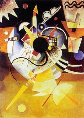
I really like Circles on Black, it's like an explosion of the moon. Here in the 1920s we start to see Kandinsky get more linear and angular and geometric- the pure, foggy explosions are now more defined- still abstract, but now with precise, shapes (not meaning precise geometric shapes- but with definable line.)
Kandinsky had such an interesting life… lots of famous artists friends, and interactions/confrontations with all sorts of political/historical currents… he worked with, taught at Gropius' Bauhaus during Germany's lose n' crazy Weimar era… and the Nazis really disliked his work. The Bauhaus closes for good in 1933, when Hitler takes power… fascinating story, I must look into it.
Blue Circle, good one. In the Black Square, super geometric/ abstract. One Center- gorgeous, it looks like a snow globe that predicts the future. “Yellow Red Blue,” “Composition 8”… Ah, I really enjoy “Light”- a smaller canvas but very pretty, a bright aqua sea background, an intricate red/orange instrument in the foreground. I love “Accent in Pink,” the deep purple background, the golden brown diamond, the bright pink circle among a field of darker circles.
His twilight years in Paris… lighter, softer color, biological motifs, experimentations with materials… I like the sand and pigment look, I'm kindof in the mood to try it.
He lived in Nazi occupied Paris- wow. The city was liberated in the last few months of his life, when he was essentially ill and bedridden. What a history!
“Movement I”- beautiful. The constellations of a deep brown night sky. Compellingly intricate. Looks like space, according to a 1970s filmstrip.
“Thirty”- amazing. Chessboard squares of black and white, with symbols that look like the alphabet of an ancient, or alien language (or symbols that Led Zeppelin would use).
“Upward” looks like a 1980s Science textbook cover- and I don't mean that in a derogatory way.
“Around the Circle” looks like the glowing pastel contents of a magic box, emptied on a Billiards table.
I enjoy “Sky Blue”… it's rather whimsical, all these strange, bright creatures, falling/hovering in the sky… it's almost like a parody or a parallel to that Michaelangelo painting of the saint getting torn about by hideous, flying demons.
His final years have a linearity and a whimsy to them. Figures that seem like little amoebas or creatures, floating about, interacting with the work.
Overall- the interactions of his life with political history are utterly compelling, and it's cool that his stylistic evolutions are so distinct. Now I feel like, when I see a Kandisnky, right away I'll know in which phase of his career he painted it, that's how distinct the phases get. A cool, lovely exhibit .
.jpg)
No comments:
Post a Comment