The Civil War & American Art (The Metropolitan Museum of Art)
And The War Came-
Martin Johnson Heade's Approaching Thunder Storm- this piece gives me chills. The black water, the dark curve of the wall of clouds, the quiet man in red, that poor sweet little white dog. That sharp white sail in the center, dividing the piece in two… man. Effective piece.
Sanford Robinson Gifford- A Coming Storm. Lake George in that fiery autumnal red, the water a cold mirror, the sky a circle of light- bright, pre-rain- with fire-like smoke and clouds encircling.
Melville saw this piece himself, in New York- exciting to get to share this experience with him. Frederic E. Church- Meteor of 1860- a beautiful piece, that perfect violet hue and the sparkling celestial fireworks.
Love Our Banner in the Sky. The red lightning on the tree- like it's already on fire. The proud and wounded flag.
The thing that really sticks with me is the American landscape, those fall trees, the hints of yellow- I don't quite know how to put it. American woods, American earth, has its own distinct look, something beautiful to it, familiar. I can smell it. I can feel the air. It's a very sweet and placid world this war came to.
At The Front-
Bierstadt's Guerrilla Warfare, Civil War. A slightly passive, distant view… like he's just lounging at his canvas, watching the soldiers… Homer's Skirmish in the Wilderness- I love these dark, wooded colors- also, terrifying. The smoke, the slumped over figure (a bullet through his forehead?)
I love Defiance: Inviting a Shot Before Petersburg. Something beautifully American, and utterly manly, about that characteristic of defiance.
Homer's Home, Sweet Home- love the color of the jacket. His details are so brightly rendered, I enjoy his texturing, largely created by those contrasts of dark and light. This was the other side of the war- the long waits…
Chapman and Gifford-
Conrad Wise Chapman- the only professional Confederate artist, it seems. A painting of the Hunley, a Confederate submarine- found in 2000. I wanna look up that story. Chapman's views of Ft. Sumter are beautifully lit. Fort Sumter, Interior, Sunrise. I didn't realize what a miserable heap of mud Ft. Sumter was- but it makes sense. Shelled all the time. Love the water and the light, the huddled crew around the fire. What an insane way to experience the war, guarding that muddy hole- feels like a weird dirty broken down Scifi story. Like something out of Firefly.
John Gadsby Chapman- Evening Gun, Ft. Sumter- love this one (painted by the father, after the son.) The bright pink, the purple smoke, the brave, defiant, sharp angles, the sharp lift of the flag. Gifford's Camp of the Seventh Regiment, Near Fredericksburg, Maryland. The light and the air in this piece is just Magnificent… and so open… I want to live this moment.
Bivouac of the 7th Regiment- a beautiful piece, another moment I want to live- the dark dream of camp life at night, stoic, the fire. Not til I sat down, some distance from the piece, did I admire the balance of the two lights, moon and fire, like Heaven and Hell, their realms divided on the picture plane by the angled edge of the tallest tree.
Sunday Morning at Camp Cameron, Near Washington- "exhibited in the Oval Office, 1976-1989." Two Republicans and Jimmy Carter. No surprise. I'll have to see if I can find it in a photo from that era. The Preacher and his American flag. Those folksy Preachers, doing their political American duty. I wonder if the soldiers enjoyed this part of their week or if it was boring- if they bought into it or if it was, "we have to wake up early for This?"
Abolition and Emancipation-
Love the bright clean colors of Eastman Johnson's The Old Mount Vernon. He painted the side and the rear- where the slaves were hanging out. Boy. That is Ballsy.
Johnson's Negro Life In The South- I saw this a few years ago at the Met's great American painting exhibit. I love the moss on the soggy planks- the setting is decrepit but still earthy, organic, vibrant.
A Ride for Liberty- the Fugitive Slaves. This is another chills piece. I can feel the cold air. This moment is thunderous and ice quiet, going back and forth in my imagination. Stunning.
Slave Hunt, Dismal Swamp, Virginia. I love the deep, rich tangle of greens- but the human element of this piece is dark and terrifying. Christmas Time, the Blodgett Family- a much more comfortable environment than the vast majority of this exhibit. Good life for that guy, ay? Especially startling in direct contrast to the Slave Hunt piece. Jesus.
A Harvest of Death-
Alexander Gardner, Photos of Antietam 9-19-63.
This is where it gets real. All the glory, the ideology, the soft lighting, is gone. This is just dusty fields, in gray and brown, and dead men. Those gaping, bloated mouths… everything goes stone silent. This is a haunting, horrifying funeral montage. It reminds me of the chamber of blackness and the LBJ library, where they address the JFK assassination- a touch over 100 years later…
President Lincoln on the Battlefield, Antietam- a classic image; until now I've never seen it close enough to read Lincoln's expression- the dude looks annoyed. In a funny, "ugh, you" kinda way. Like he just smelled shit and realizes he can't leave this spot for a while.
Reconciliation and the Reconstruction Era-
Homer's Prisoners From the Front- the space between North and South, and the destruction of the land… this was a beating into submission. Not a truce.
The Fire of Leaves- a poignant, slightly cloying piece- but you need that deeply sappy thread of hope after such devastation. The beautiful sunset violet glow over everything, and that utterly American landscape. Homer's The Veteran in a New Field- another poignant classic, a piece I've seen previously on exhibit.
The Cotton Pickers- really like this one. That sad and thoughtful blend of doubt and determination- what future is out there for these young women? Man, just thinking of each generation, the determined build over every generation towards freedom and opportunity, the long moral arc of the universe.
Dressing for the Carnival- for whatever reason, depictions of low status people having frivolous fun always make me feel like weeping, in the worst way. Even when it's a positive story.
The Girl I Left Behind Me- another chills piece. The gray on all sides, the windswept hair- she's Dorothy. Holding her books, stoic, waiting for the path forward to emerge- but not scared. Determined.
Landscapes of War-
Homer Dodge Martin's The Iron Mine, Port Henry, New York. A big, pretty picture, rusty reds and greens… the scars in the landscape. Reminds me of how useful it is to have superior resources available. That's the American way.
George N. Barnard's photos of the destructive aftermath of Sherman's march. The horse skull in Scene of General McPherson's Death- haunting. God damn- Ruins in Charleston, South Carolina and Columbia, from the Capitol- man. Sherman Wrecked that place.
And upstairs, some Mammoth canvases. Every one of them is magnificent.
Frederic Church's Aurora Borealis- Oh My God. Oh My God. Will I ever see such a magnificent and beautiful sight in my life? The mountain of ice, the explosions of red and the bright blue fire branded through the clouds, the tiny ship caught in the snow, the black sphere, like a sun or a rolling boulder; it all reminds me of Moby Dick, the massiveness of nature.
Love the gleaming red sun and orgasmically violent smoke, and the pouring waterfall, of Church's Cotopaxi.
The Icebergs: love the glowing green tunnel in the corner. Rainy Season in the Tropics- an optimist's picture, the grand hope for crossing over, the safe passage… Bierstadt's Looking Down Yosemite Valley, California- no corrupting human element, a New Eden. The dream of the West as a fresh Frontier. A depiction of that dream of the fresh start, the bloodletting over.
The gallery spans from the cold, overpowering, dramatic blue of Aurora Borealis, to the placid golden glow of Yosemite Valley. A passage from trepidation to hope, moving Prewar to Postwar. And to counter, John Frederick Kensett's Sunrise Among the Rocks of Paradise, Newport, 1859; and Paradise Rocks: Newport, 1868.
The golden violet spring glow of the young work; the somber wintry clarity, even down to the simpler and sadder title of the old work. It's a story of paradise lost; it's a story of getting older. I love it.
A good exhibit- there's not much America did better, artwise, than landscape painting- and I love all the ways landscape painting created allegories for the war. Tons more respect now for Homer and Church. Those guys are amazing.
Showing posts with label museum reflection. Show all posts
Showing posts with label museum reflection. Show all posts
Saturday, June 15, 2013

Sunday, June 2, 2013
exhibit #3
CLAES OLDENBURG: THE STREET AND THE STORE/ MOUSE MUSEM & RAY GUN WING; THE SCREAM; ET AL (MoMA)
Painting & Sculpture Galleries
Jacob Lawrence- Migration Series- great as always. A beautiful story of adventure and ambition, those American colors, the simple, dynamic depiction of grit and resolve. The next room, all the old hits- Miro, the Dadaists, Picasso's Girl Before a Mirror. I like Piccabia's M'Amenez-y, a goofy work with a lovely balance of gold and green. Magritte's The Empire of Light, II- a lovely and haunting, placid evening work.
Ernst's The Blind Swimmer- love the green and the detailed lines. Looks a bit like a wheat field. Is it a bisection of the eye? Is this what the blind swimmer sees? I like it. Next room, Modigliani, Picasso's Three Women at the Spring and Three Musicians. I'm liking Giorgio de Chirico, his comic book palette. The lines remind me of Dali- an odd, haunted evening city, like a dream.
The Mondrian room… I'm drawn to Composition with Red, Blue, Black, Yellow and Gray, 1921- the blue tint on his classic look. Lovely. Stepanova's Figure (1921)- love it. Looks like late-stage Kandinsky, pulled together and animated in a living form.
The Monet Room, lovely of course. The meditative pastel beauty of Water Lillies,(1924-1925) particularly dreamy. The autumn fire of The Japanese Footbridge draws me too. An interesting point- MOMA got these Monet panels in 1955. Timing was key- Pollock's style and scale made the abstract expressive qualities of Monet's work hip and relevant again. That's why MOMA got these.
The Klee room- Pastorale (Rhythms) reminds me of the Rosetta Stone. sigh… Fire in the Evening is a beauty- I'm virtually certain I've noticed and noted it on a previous trip (the Bauhaus, I believe.) Or the Mocked Mocker is pretty great. Reminds me of Lite Brites. Klee is probably the closest, among legendary artists, to my mother's style. He's just fun- and so detailed. I love so many- Introducing the Miracle, Demon Above the Ships (reminds me just a bit of a Chinese dragon, some sort of east asian myth), The End of the Last Act of a Dream, the Angler, Around the Fish- so many terrific pieces. Augustus Vincent Tack- Dunes, a pretty canvas. Almost like a satellite map. Kupka's View from a Carriage Window- a hint of a tropical dream. Kandinsky's four panels, and Kirchner's Street, Dresden, in the corner by the stairs. Lovely.
The Matisse room. The Red Studio is my favorite of his. Also I'm drawn to the beautiful grays and firm vertical lines of Woman on a High Stool.
The Scream
Here we are- The Scream. One of those pieces that gets the Mona Lisa treatment. Love the red sky. It's 3 shapes- the red divides two traingles and the sky creates a rectangle above. A nice balance of elements here. It reminds me of Nirvana- Nirvana brought the dark and unsettling into the mainstream, but they did it by crafting highly accessible, pretty pop music. Likewise, The Scream is a dark and unsettling piece, but it's that highly accessible, pretty balance of elements- the melody of the painting- that makes it a compelling classic.
Oh, I love his painting, The Storm- dreamy, dark gray rain, the white figure. So compelling. Munch's Madonna, set at the moment of conception- sexy and scary. A compelling piece. Could be a '70s punk flyer.
Painting & Sculpture Galleries, Continued
The Futurist room. My favorite is Carras' Funeral of the Anarchist Galli, the dazzling, kaleidoscopic drama of reds, greens and darkness.
Ellen Auerbach- Elliot Porter in New York. Oh, I love this photo. I'm such a sucker for 1950s NYC photography. A room of Porter's bird photography. Love it. A bird's look does not change with the seasons- a cardinal in 1800 is the same as a cardinal now. I wonder if any animal besides man has "fashion," in that pop evolutionary sense. I love the intimacy of the feeding scenes and the exultant free spirit of the Blue Throated Hummingbird.
The Cubist room. Les Demoiselles d'Avignon, the most famous painting whose name I never remember. Picasso's Repose- haven't seen this one before. Love the caramel palette, the sense of peace. Reminds me of a poetry club in Washington Heights.
Another classic room. Henri Rousseau- The Dream, an old favorite of mine. Takes me back to my childhood doctor's office. The Sleeping Gypsy is here, my other love. It's only just now occurring to me, his two classics- the Sleeping Gypsy, the Dream- could exist in the same moment of reality, if one chooses so.
Odilon Redon, beautiful as always. James Ensor, some fantastic, creepy stuff- Boschlike. And Starry Night of course, fabulous. Such rich blues. The green golden moon. The village at peace, the Heavens turbulent. The marvelous motion in each line, each one a little sweep of a dream. Gaugin's Still Life with Three Puppies- charming! And they close out the floor with Warhol's cans. nice.
4th Floor- all the geometric minimalist stuff… I like Richard Hamilton's Pin-Up. The Johns & Rauschenberg room, always one of my favorites. Two Rauschenberg combines are here- Canyon is the star, a recent acquisition. Slowly but surely I'm getting through my lasting NYC art regret- missing out on his combines show at the Met.
*K
L and I love Green Target.
Next room, some Joseph Cornell boxes. Central Park Carousel, In Memoriam, (a wondrous dream of the stars), and Untitled (Hotel Beau-Sejoir) Mondrian and Newman. Pollock, de Kooning. Fernand Leger- The Three Musicians. Stoic, elegant, an image of dignified strivers. I like it. Humble and hopeful in the same motion, and a parallel to Picasso's dynamic musicians too. Picasso gets them in the heat of performance; this is their family portrait. (I zipped through that floor pretty quick, want to assure time for some other things.)
(Miscellany)
Dieter Roth- Six Piccadillies- pretty. Six interpretations of a postcard, Warholian. I particularly like the flat, bright, late 60s/70s piece. Applied Design floor- there's a minty teal-green setup that Katie would just love. Also on this floor- lots of video games, popular with the kids. I like the Pig Wings project. Kinda creepy, but aesthetically beautiful.
9+1 Ways of Being Political
An activist architectural design exhibit. Being Political here meaning 'an interaction with the urban realm.' I like Aldo Rossi's Urban Construction. I'm getting too tired to draw anything from this exhibit, it's got less politics and more dioramas than I was hoping for. I think it's about time I pack it in…
Claes Oldenburg: The Street and The Store.
"I am for all art that takes its form from the lines of life itself, that twists and extends and accumulates and spits and drips, and is heavy and coarse and blunt and sweet and stupid as life itself." Love it.
The Street
Dirty, the Rauschenberg palette of cardboard, burlap browns. Street Chick is particularly striking. I like Street Sign I- looks a bit like a unicorn, or a chess knight. The little Letter Tenement, tiny, lost in the shuffle, clothed in rags- the city's orphan. The Big Man- reminds me of the Met's tribal art. He leans casually, confident, and blank, and stupid. A false God. Funny. A dirty, dripping exhibit. Everything he touches becomes a gruesome parody, overblown, ugly, fat, dripping, silly. he's one of the funniest artists I think I've ever seen. It's funny to imagine somebody back then, appalled and annoyed by this exhibit, and now- joke's on them. This is all in MOMA!
Flags (summer 1960)- Johnslike, though I like Johns' more. My two favorites- corklive flag (I think?) and Landscape with flag and moon- a bit of a dream. American Flag and Street Chick- a lovely blur of color, that turn of the head. It reminds me of a woman looking back just as a bomb explodes… shades of Boston darken my imagination.
The Store
(he had it all set up 107 E 2nd Street- Ray Gun Manufacturing Company.) Suddenly color enters his palette. Commercial objects, depicted in a saggy, vile, comical way. Mannikin with One Leg looks like fireworks, or Starry Night. a very pretty piece. Candy Container with Candy (looks like paint tubes to me), Upside Down City- an octopus.
Breakfast Table- it's fun to take all this in as the living embodiment of the real-time rejection of Mad Men- This is what was going down in the village, when the surface was all suburbs and gloss. Oldenburg's blunt, unimpressed depictions expose the emptiness of the dream.
His classic Floor Burger. There's a guard here, and her sole responsibility is to watch that burger. Cigarettes in Pack (fragment), 7 Up… it's all- there's not too much I feel like saying about it. It's a funny exhibit, a crude parody, it almost makes me laugh at these objects and ideas. It blows up the store. Bacon and Egg 1965- the colors of this one- particularly nice, lovely.
His big, soft sculptures- to draw aparallel to the vast car showrooms of the day. This big floppy piece of cake is pretty hilarious. It changes what a sculpture can be- no longer "rigid, austere"- and it brings the every day to fine art, blows up the pedestal a little bit. He's not just mocking consumer culture here, he's mocking the art world. and in a way, this is a retroactive parody- my classic critique of the Chelsea galleries is that it's all scale, no insight- gigantic magazine covers. You can consider Oldenburg a predecessor and inspiration to these guys, but I think he still mocks them- it's just so big, dumb and whimsical. a big dumb floppy hamburger. He's Showing us it's a silly idea.
Watch in a Red Box- like an alligator's mouth, or a turtle's. Sewing Machine- love the colors. Nice triad here- Mu-Mu, Sewing Machine, Auto Tire with Fragment of Price. The rule now is 'do not touch,' but I wonder if Claes allowed it back then. I can see how it would play with the relationship of work to artist to Allow the touch- but also it's a tighter parody to gravely, self-seriously disallow it.mall I can think about is how much I want to sneak a touch.
Mouse Museum & Ray Gun Wing
I'm gonna give Mouse Museum a try- Oldenburg's collection of objects. It's shrouded, a mystery, yet there are videos playing on a loop, showing off glances of the interior. Feels like a violation of a church's secret scrolls- or on the flipside, it's creating a celebrity effect, the replicated media image creating the hype of familiarity for the presence of the real thing. Two thoughts here- (A) if I were to organize a show, maybe I'd start with video screens to comment on exactly this. (B) That's exactly the effect it had on me- I was charmed by a little seal with a crystal, from the video; I was discouraged not to find it on my first visit, and came back, waited in line again, studied the video, for the specific cause of catching this celebrity.
Inside, pretty cool- felt like being in a submarine, warm, dark, an eerie waterlike soundtrack. Food, anatomy, toys, commerce, plastic- these seem to be Oldenburg's preoccupations. It reminded me a Lot of Mark, or Mom's things. It's fascinating to think of all the beautiful, incredible, intriguing pop culture deritrus collections there are- this one is in MOMA, but probably everyone knows somebody with a similar collection- we each have that one compellingly odd friend. My favorite object- the pink turtle cigarette dish! (and of course, the famed seal.)
Ray Gun Wing- fine.
*NOTE- email Mom about this! she'd love it.
Painting & Sculpture Galleries
Jacob Lawrence- Migration Series- great as always. A beautiful story of adventure and ambition, those American colors, the simple, dynamic depiction of grit and resolve. The next room, all the old hits- Miro, the Dadaists, Picasso's Girl Before a Mirror. I like Piccabia's M'Amenez-y, a goofy work with a lovely balance of gold and green. Magritte's The Empire of Light, II- a lovely and haunting, placid evening work.
Ernst's The Blind Swimmer- love the green and the detailed lines. Looks a bit like a wheat field. Is it a bisection of the eye? Is this what the blind swimmer sees? I like it. Next room, Modigliani, Picasso's Three Women at the Spring and Three Musicians. I'm liking Giorgio de Chirico, his comic book palette. The lines remind me of Dali- an odd, haunted evening city, like a dream.
The Mondrian room… I'm drawn to Composition with Red, Blue, Black, Yellow and Gray, 1921- the blue tint on his classic look. Lovely. Stepanova's Figure (1921)- love it. Looks like late-stage Kandinsky, pulled together and animated in a living form.
The Monet Room, lovely of course. The meditative pastel beauty of Water Lillies,(1924-1925) particularly dreamy. The autumn fire of The Japanese Footbridge draws me too. An interesting point- MOMA got these Monet panels in 1955. Timing was key- Pollock's style and scale made the abstract expressive qualities of Monet's work hip and relevant again. That's why MOMA got these.
The Klee room- Pastorale (Rhythms) reminds me of the Rosetta Stone. sigh… Fire in the Evening is a beauty- I'm virtually certain I've noticed and noted it on a previous trip (the Bauhaus, I believe.) Or the Mocked Mocker is pretty great. Reminds me of Lite Brites. Klee is probably the closest, among legendary artists, to my mother's style. He's just fun- and so detailed. I love so many- Introducing the Miracle, Demon Above the Ships (reminds me just a bit of a Chinese dragon, some sort of east asian myth), The End of the Last Act of a Dream, the Angler, Around the Fish- so many terrific pieces. Augustus Vincent Tack- Dunes, a pretty canvas. Almost like a satellite map. Kupka's View from a Carriage Window- a hint of a tropical dream. Kandinsky's four panels, and Kirchner's Street, Dresden, in the corner by the stairs. Lovely.
The Matisse room. The Red Studio is my favorite of his. Also I'm drawn to the beautiful grays and firm vertical lines of Woman on a High Stool.
The Scream
Here we are- The Scream. One of those pieces that gets the Mona Lisa treatment. Love the red sky. It's 3 shapes- the red divides two traingles and the sky creates a rectangle above. A nice balance of elements here. It reminds me of Nirvana- Nirvana brought the dark and unsettling into the mainstream, but they did it by crafting highly accessible, pretty pop music. Likewise, The Scream is a dark and unsettling piece, but it's that highly accessible, pretty balance of elements- the melody of the painting- that makes it a compelling classic.
Oh, I love his painting, The Storm- dreamy, dark gray rain, the white figure. So compelling. Munch's Madonna, set at the moment of conception- sexy and scary. A compelling piece. Could be a '70s punk flyer.
Painting & Sculpture Galleries, Continued
The Futurist room. My favorite is Carras' Funeral of the Anarchist Galli, the dazzling, kaleidoscopic drama of reds, greens and darkness.
Ellen Auerbach- Elliot Porter in New York. Oh, I love this photo. I'm such a sucker for 1950s NYC photography. A room of Porter's bird photography. Love it. A bird's look does not change with the seasons- a cardinal in 1800 is the same as a cardinal now. I wonder if any animal besides man has "fashion," in that pop evolutionary sense. I love the intimacy of the feeding scenes and the exultant free spirit of the Blue Throated Hummingbird.
The Cubist room. Les Demoiselles d'Avignon, the most famous painting whose name I never remember. Picasso's Repose- haven't seen this one before. Love the caramel palette, the sense of peace. Reminds me of a poetry club in Washington Heights.
Another classic room. Henri Rousseau- The Dream, an old favorite of mine. Takes me back to my childhood doctor's office. The Sleeping Gypsy is here, my other love. It's only just now occurring to me, his two classics- the Sleeping Gypsy, the Dream- could exist in the same moment of reality, if one chooses so.
Odilon Redon, beautiful as always. James Ensor, some fantastic, creepy stuff- Boschlike. And Starry Night of course, fabulous. Such rich blues. The green golden moon. The village at peace, the Heavens turbulent. The marvelous motion in each line, each one a little sweep of a dream. Gaugin's Still Life with Three Puppies- charming! And they close out the floor with Warhol's cans. nice.
4th Floor- all the geometric minimalist stuff… I like Richard Hamilton's Pin-Up. The Johns & Rauschenberg room, always one of my favorites. Two Rauschenberg combines are here- Canyon is the star, a recent acquisition. Slowly but surely I'm getting through my lasting NYC art regret- missing out on his combines show at the Met.
*K
L and I love Green Target.
Next room, some Joseph Cornell boxes. Central Park Carousel, In Memoriam, (a wondrous dream of the stars), and Untitled (Hotel Beau-Sejoir) Mondrian and Newman. Pollock, de Kooning. Fernand Leger- The Three Musicians. Stoic, elegant, an image of dignified strivers. I like it. Humble and hopeful in the same motion, and a parallel to Picasso's dynamic musicians too. Picasso gets them in the heat of performance; this is their family portrait. (I zipped through that floor pretty quick, want to assure time for some other things.)
(Miscellany)
Dieter Roth- Six Piccadillies- pretty. Six interpretations of a postcard, Warholian. I particularly like the flat, bright, late 60s/70s piece. Applied Design floor- there's a minty teal-green setup that Katie would just love. Also on this floor- lots of video games, popular with the kids. I like the Pig Wings project. Kinda creepy, but aesthetically beautiful.
9+1 Ways of Being Political
An activist architectural design exhibit. Being Political here meaning 'an interaction with the urban realm.' I like Aldo Rossi's Urban Construction. I'm getting too tired to draw anything from this exhibit, it's got less politics and more dioramas than I was hoping for. I think it's about time I pack it in…
Claes Oldenburg: The Street and The Store.
"I am for all art that takes its form from the lines of life itself, that twists and extends and accumulates and spits and drips, and is heavy and coarse and blunt and sweet and stupid as life itself." Love it.
The Street
Dirty, the Rauschenberg palette of cardboard, burlap browns. Street Chick is particularly striking. I like Street Sign I- looks a bit like a unicorn, or a chess knight. The little Letter Tenement, tiny, lost in the shuffle, clothed in rags- the city's orphan. The Big Man- reminds me of the Met's tribal art. He leans casually, confident, and blank, and stupid. A false God. Funny. A dirty, dripping exhibit. Everything he touches becomes a gruesome parody, overblown, ugly, fat, dripping, silly. he's one of the funniest artists I think I've ever seen. It's funny to imagine somebody back then, appalled and annoyed by this exhibit, and now- joke's on them. This is all in MOMA!
Flags (summer 1960)- Johnslike, though I like Johns' more. My two favorites- corklive flag (I think?) and Landscape with flag and moon- a bit of a dream. American Flag and Street Chick- a lovely blur of color, that turn of the head. It reminds me of a woman looking back just as a bomb explodes… shades of Boston darken my imagination.
The Store
(he had it all set up 107 E 2nd Street- Ray Gun Manufacturing Company.) Suddenly color enters his palette. Commercial objects, depicted in a saggy, vile, comical way. Mannikin with One Leg looks like fireworks, or Starry Night. a very pretty piece. Candy Container with Candy (looks like paint tubes to me), Upside Down City- an octopus.
Breakfast Table- it's fun to take all this in as the living embodiment of the real-time rejection of Mad Men- This is what was going down in the village, when the surface was all suburbs and gloss. Oldenburg's blunt, unimpressed depictions expose the emptiness of the dream.
His classic Floor Burger. There's a guard here, and her sole responsibility is to watch that burger. Cigarettes in Pack (fragment), 7 Up… it's all- there's not too much I feel like saying about it. It's a funny exhibit, a crude parody, it almost makes me laugh at these objects and ideas. It blows up the store. Bacon and Egg 1965- the colors of this one- particularly nice, lovely.
His big, soft sculptures- to draw aparallel to the vast car showrooms of the day. This big floppy piece of cake is pretty hilarious. It changes what a sculpture can be- no longer "rigid, austere"- and it brings the every day to fine art, blows up the pedestal a little bit. He's not just mocking consumer culture here, he's mocking the art world. and in a way, this is a retroactive parody- my classic critique of the Chelsea galleries is that it's all scale, no insight- gigantic magazine covers. You can consider Oldenburg a predecessor and inspiration to these guys, but I think he still mocks them- it's just so big, dumb and whimsical. a big dumb floppy hamburger. He's Showing us it's a silly idea.
Watch in a Red Box- like an alligator's mouth, or a turtle's. Sewing Machine- love the colors. Nice triad here- Mu-Mu, Sewing Machine, Auto Tire with Fragment of Price. The rule now is 'do not touch,' but I wonder if Claes allowed it back then. I can see how it would play with the relationship of work to artist to Allow the touch- but also it's a tighter parody to gravely, self-seriously disallow it.mall I can think about is how much I want to sneak a touch.
Mouse Museum & Ray Gun Wing
I'm gonna give Mouse Museum a try- Oldenburg's collection of objects. It's shrouded, a mystery, yet there are videos playing on a loop, showing off glances of the interior. Feels like a violation of a church's secret scrolls- or on the flipside, it's creating a celebrity effect, the replicated media image creating the hype of familiarity for the presence of the real thing. Two thoughts here- (A) if I were to organize a show, maybe I'd start with video screens to comment on exactly this. (B) That's exactly the effect it had on me- I was charmed by a little seal with a crystal, from the video; I was discouraged not to find it on my first visit, and came back, waited in line again, studied the video, for the specific cause of catching this celebrity.
Inside, pretty cool- felt like being in a submarine, warm, dark, an eerie waterlike soundtrack. Food, anatomy, toys, commerce, plastic- these seem to be Oldenburg's preoccupations. It reminded me a Lot of Mark, or Mom's things. It's fascinating to think of all the beautiful, incredible, intriguing pop culture deritrus collections there are- this one is in MOMA, but probably everyone knows somebody with a similar collection- we each have that one compellingly odd friend. My favorite object- the pink turtle cigarette dish! (and of course, the famed seal.)
Ray Gun Wing- fine.
*NOTE- email Mom about this! she'd love it.
Monday, January 7, 2013
exhibit #2
WW2 & NYC; JOHN ROGERS; THE POP SHOP; ET AL (New York Historical Society)
Pretty proud that my favorite museum has become super beautiful. Don’t even know where to begin.
The Front Hall
A salon style presentation of Revolution-era artifacts rises parallel to a hall of a 9/11 photography, and a heavily dented fire engine door. Bent, not broken. Nice choices, a past and present bookend effect. In a display covering the Civil War, I just read the entire Emancipation Proclamation. So, so good. Displays about the arts and culture- this city makes me want to do more, bigger, better. Such an amazing place, and we can all contribute. Faceless mannequins in uniform, evoking that 1940s ideal, the classy patriots. Man, beautiful hall.
WORLD WAR II & NYC
Right as you enter, the crackle of the radio (the Battle of Britain), a sorrowful, concerned portrait of FDR, a map of the world, Axis Empire colored red. Amazingly tense. I’m captivated, my heart is moving differently. Before Pearl Harbor Three quarters of the city population were first or second generation immigrants, and political organizations in the city had a stake in the outcome as well. Man, imagine Union Square in 1940, or the debates rattling on at a bodega. Anti-Hitler Symposium, May 25, 1934, at the New School… Chagall, Ernst and Duchamp were among the refugees rescued from Europe, by Varian Fry. Most New Yorkers wanted neutrality. Mr. Smith and Mr. Schmidt, a cartoon book by Ben Martin, contrasting democratic citizens and citizens of a dictatorship. His point seems to be that man can be good or evil, right or wrong- I’d rather a book that shows Smith vs. Schmidt as free vs. unfree, a more empathetic take- equally capable men, but one is a victim of dictatorship. Both types of men exist in both nations, I suppose. American Nazism- strong in the German neighborhood of Yorkville. Must’ve irked the Marx Brothers. Fritz Kuhn- leader of the pro-Nazi German American Bund. LOVE this Dr. Seuss cartoon! Daredevil vs. Hitler! A marvelous real-life example of Kavalier & Clay’s Escapist storylines. Florence Mendheim- learn more about her. What a story.
After Pearl Harbor, the debate is over- mobilization begins, transforms New York. “Peacetime conventions yielded to new priorities.” When You Ride Alone, You Ride With Hitler- love this poster. Did not know the 23d-34th section of FDR Drive is built above rubble from Bristol, England. This Is The Enemy- iconic poster, shown here as a stamp; Artists for Victory. Slave World or Free World, a stamp that looks like what I wanted Smith vs. Schmidt to be. Arms & Armor Department at the Met designed head and body armor for American soldiers- wow. Joe Palooka K/Os the Nazis! Pretty awesome. Scuttlebutt goes to war- adorable! Heartbreaking. A Hitler piggy bank, awesome. Get In The Scrap: A Game with a Patriotic Purpose. I love this exhibition-specific mural of the blacked out skyline, a hundred ships ready to sail. The lengths New York went to to beat the U-Boats. NYC, #1 in war production, #1 in exports- the city where most of the freight ships launched in the Battle of the Atlantic.
New York wanted to do everything they could- and entertaining soldiers before/between their overseas tours- another essential contribution. Man, imagine all the soldiers who had never seen Anything like New York, what a mad, cinematic explosion of discovery and sensory expansion. Lauren Bacall worked as a dancer in New York, entertaining soldiers. I love that some of our boys could look back and Swear they danced with Lauren Bacall. I Love William Henry Johnson’s Jitterbugs V. Irving Boyer, Prospect Park- a dreamy, boozy scene. Latin Quarter- free for Men in uniform! An American Sailor and a Young Woman do the Lindy at the Stage Door Canteen- I love this picture.
Embarkation- what a scene. Love that handsome soldier looking back- the empathetic star of this picture. This mannequin, a buxom woman in a Navy outfit- WAVES- let’s be frank… this is very hot. And heroic, obviously.
Boy, New York basically Owned the war. Just Crushed it. It’s a signature achievement for this city- to go from ten different opinions, most prevalently “we don’t wanna,” just add Pearl Harbor- “we will Crush you.” I love it. Seriously beats NYC during the Civil War- now there’s an ugly scene.
New Yorkers who Served… Man, I love President Roosevelt. Such a powerful, comforting visage. Inspirational. Wow, I Love Jacob Lawrence’s Disembarkation and No. 2 Main Control Panel, Nerve Center of a Ship. Really amazing and beautiful. The soldiers, a faceless herd of heroes, moving like heavy rain.
“If I ever get home, I’ll know there’s one place waiting for me- a small alcove in your heart.” Oh my God, Sidney Diamond. Kills me. So romantic and heartbreaking, his letters to his fiancee.
I could almost cry reading over these profiles. I’m just so proud of these people, these Americans.
Robert Fleischer, what a story. Joined to avenge his cousin’s death at Pearl Harbor. A closeted homosexual who was able to make relations with men in the army- man, imagine all the Brokeback Mountains forged in that conflict. A Jew who faced antisemitism in his own unit, especially from his commanding officer; a Jew who liberated Dachau.
HITLER DEAD IN CHANCELLERY, NAZIS SAY- New York Times 5/2/45 headline.
Eisenhower’s VE-Day Telegram. Soldierly. No unnecessary words. Man. VJ Day, Times Square. “Thousands of people with overwhelming joy, just letting go, as though everything terrible has ended.”- Delaney’s perfect description of the scene in New York on VJ Day. I count among the best days of my life, the night that I felt something close to this- I can only imagine VJ Day though, probably the best day in the life of millions, millions of people. Possibly the best party New York ever threw.
An absolutely beautiful, grand, dazzling final piece, a burst of pure light. A very exciting and fitting end point. But of course, after the supernova, life continues, the struggle, the incomprehensible aftermath…
Chaim Gross- In Memoriam: My Sister Sarah, Victim of Nazi Atrocities. The melancholy curve. Stoic. Perfect, silent agony. My God. My God. Isamu Noguchi’s Bell Tower For Hiroshima- an unrealized design. Horrifying, solemn, incredible. A suspension of a moment, and an endless, haunting rattle.
The War for Civil Rights
Apparently there was a prejudice about blood transfusion- an assumption that blood types were determined by race, and that one could "catch" a race via blood transfusion, like it was an illness. Glad that we've triumphed over that particular foolishness. I didn’t realize the origin of Stuyvesant Town, that it was built preferentially for World War Two veterans- and whites only. A titanic civil rights struggle.
And at the very end of the Hall, finally- VJ Day in Times Square, the old icon.
Landmarks of New York
A black & white photo series by Barbaralee Diamonstein-Spielvogel. Big takeaways- The New School’s auditorium inspired Radio City Music Hall; Charlie Parker lived at 151 Avenue B. And, hey! There’s the Little Red Lighthouse, which JD and I walked up to once upon a time.
GI Sketch Diary: Ben Brown’s World War II Drawings.
A GI who fought in North Africa and Italy- Pyle’s route! (though he got there after Pyle)- and kept a sketch pad with him, drew constantly. Love this watercolor of GIs slouching past a wrecked Nazi tank. Work is work. Something heroic in the haggard, determined soldier laying telephone line, in this graphite sketch. his pictures from Italy, the wreckage- the children- astonishing. I love this. Poetry. What a cool guy.
John Rogers: American Stories
Never heard of him before, though I’ve surely seen him. ‘The People’s Sculptor,’ the most popular American sculptor of the 19th century. Created small groupings of figures, starting just before the Civil War, and his production/distribution methods helped him gain widespread popularity. He’s hard to categorize today and is largely forgotten- seems like the Thomas Kincaid of that century. Rogers used plaster to make sculpture more affordable- “he placed fine art within most people’s reach for the first time.” Wounded Scout, a friend in the swamp- dramatic, heroic, romantic in scope. I’m all about it. I can see the entire landscape surrounding them, beyond the boundaries of the piece. Union Refugees, 1863, Returned Volunteer: How the Fort was Taken, Challenging the Union Vote, 1869- a scene still relevant today. Sharp Shooters- pretty fun, I like it. Mail Day- Rogers couldn’t decide what to make so he sculpted a soldier who can’t decide what to write. The Picket Guard- at the left, Leonardo DiCaprio. The decade after the war’s end was the height of Rogers’ career; he became the country’s best known artist. The vibe here in the 1870s is basically 3D Rockwell- Rockwell Must have had this stuff around when he was a kid. The Traveling Magician- very charming; also weird to think about traveling magicians who fought in the Civil War once upon a time. Reminds me of one of my favorite moments in The Master, when we see Freddie taking mall portraits- to see the man at his friendly day job, with all that well-earned darkness churning underneath. Private Theatricals, Last Moment Behind the Scenes- I’d love to learn more about theatre in this era. School Days- love how annoyed these kids are with that weird monkey. Not a high-seller in those days- middle class parlors were no place for urban immigrant scenes. Ichabod Crane and the “Headless Horseman”- awesome. Scary!
The Hudson River School
The Best room. The Course of Empire, the New York Historical Society’s finest treasure. The primordial cauldron of The Savage State, the idealized, placid green glow of The Pastoral State (which reminds me now of Kandinsky’s theory of green [a bourgeois color, the color at rest- regenerative, unchallenging]), the red, gold and marble splendor of The Consummation of Empire, the billowing smoke, black green water, the fires and cruelties, the violent marble poses of Destruction, and the eerie, peaceful shipwreck ruin of Desolation, with the sun hanging on, just about to drift into evening. The Mountain watches it all. Desolation has the misty beauty of a cool day, Just after rain. “The exquisite stillness of a world without mankind.” And Destruction was made almost right after, even concurrently, with this Great Fire of 1835- never heard of it until today, or I'd forgotten about it. I feel like I’ve written about this room before… I’m going to write less and enjoy more, in this space. (*and if it turns out I Don’t have notes about this room somewhere, then I better come back later this year!)
Man- imagine Discovering Niagara Falls. That sight alone would make you believe in God. I love these paintings of Lake George- where is it? Never heard of it. I should reread Frederick Jackson Turner’s essay on the Frontier. View of Yosemite Valley- Astonishing. Donner Lake from the Summit seems to float above, like Heaven. Just now I had the silly thought of, the way certain Biblical concepts were informed by literal phenonema of that era- if the notion of ‘Heaven’ and ‘angels’ began as, weirdoes who lived high up in the mountains.
Thomas Cole, Italian Scene: Composition- so lovely. How I’d love to be that peasant in the foreground. Summer in the Land of the Midnight Sun- a true beauty. One of my favorites in the museum, that cloak of red light, the stoic glacial landscape, the shipwreck- like a Titanic above water, the bones of civilization. Darkness creeps into the corners. This is the room that will bring me back to this museum, year after year.
The Luce Center
Can’t beat the Luce Center. Portrait of Peter Stuyvesant makes him look like a dwarf riding a pony; was he? (only half kidding.) And, ah, a murderer’s row! Roslin’s Benjamin Franklin, Durand’s James Madison, Peale’s Thomas Jefferson and George Washington. Iconic, all of them. Highly unlikely that the Only copies of these would be in a supplemental corner of the NYHS- interesting to think of the era when reproductions had to be created manually. Asher B. Durand, pretty dashing as a younger man. Wow- Abraham Manievich, The Bronx- a spectacular cubist picture. I love it. Coming here always reminds me of the weird hierarchies of art- how does one genius make it to the Guggenheim, another to the back corners of the NYHS? Sultry Night Concert. Beautiful, dusky blues. Moving on- … So Many Fabulous Chairs! (3 Cherry Street- George Washington’s NY address.)
And, oh wow, an awesome section- a Christmas Toy Fair! The Jerni Collection- ferris wheels, train sets, tin soldiers, ornate houses and buildings. Much of it in German. This collections spans from 1850-1940, the ‘Golden Age’ of European toy manufacturing. What ended the Golden Age- the Nazis (many of the great toy firms were Jewish owned), the war, the supplanting of train travel, the rise of plastic over tin as the primary toy-making material. Amazing that such beautiful and intricate things were made for children. I love picture a 6-year old Dean Acheson in short pants with his trains; world-bestriding artistocrats of that certain age. What a grand picture of old europe. Moving on, the death masks, the life masks, and none other than John Rogers- The Council of War- love it. Grant, Lincoln, Stanton.
The Pop Shop- hell yeah. Keith Haring rules. Open a Book- and the World Opens! New York is Book Country. Awesome. The Master. whimsical, effortless, with space enough to breathe. Nothing mean or eerie in it, just pure fun. In his journal, Haring writes about how he loves children- and his paintings and drawings are so fun, so beautiful, effortless, silly- I feel an extra surge of admiration for him, I’m thinking more about how, his is a legacy I’d like to follow, an example to live up to. A man born the same year as my mother. I was hoping more of his wallpaper would be here- there’s a section of the Pop Shop wall installed on a column- I thought there would be more, a whole room.
Looking at a display- all of these objects were made by dead people. These are their children, what they leave for the world, their enduring presence. I’d like to make things that last, too. I picture myself as an anonymous member of a thriving creative scene, like one of the Greenwich village poets banging out a manuscript. I hope I’ll make some particularly good stuff over the years. Gotta learn how to market. The silver section, the Beekman family coach. The ceramics- Enoch Wood and Sons- Gorgeous rich blues; old fashioned tonic bottles, as Oiltrain would’ve hocked. The fabulous Tiffany lamp section. The Prettiest stuff.
Upstairs, Ribbons and Medals, campaign buttons (“vote for Willkie if you want to vote again.”) A ribbon worn at Lincoln’s funeral procession. What’s the name for the Rockefeller Center aesthetic- Art Deco. There are a few medals of that style here, and they’re awesome. And coins from the Civil War, and the 1830’s-40’s, and the Revolutionary/Jeffersonian era. Passing through, a vast canvas of Niagara Falls by John Trumbull- awesome. What a Big country, with such big dreams and possibilities- I’m feeling very American. Scrimshaw- appropriate for me right now, on my way through Moby Dick- in my bag, on my back right now. Civil War camp gear- a Union soldier’s cap. Weapons, police and firefighter equipment… The Great Fire of 1835- I can't get away from it, today. … A creepy-as-Hell exhibit about Puerto Rican immigration- clothes with no bodies, aligned as seats on an airplane. Like a scene out of Left Behind or a memorial to a crash. Textiles, political textiles- William Henry Harrison, Teddy Roosevelt, and- of course- W ‘04. The type of man that would attract textile-making fans. A section on spectacles, very cool. Love those green spectacles, so Oz. Past the jewelry and canes, on to the section I’ve always enjoyed, antique children’s toys. Block puzzle of a steamship. The Noah’s Ark.
Portraits of the City
A Southeast Prospect of the City of New York- amazing. That low skyline, and all woods in the hinterland- and the majestic array of British ships! Circa 1756-61. Man, life will change in Impossible ways, every generation, many times over in a lifetime. The Great Fire of 1835 as seen from New York Harbor. Extraordinary, horrifying. An orange, blazing mass, black-blue-green water, stoic survivors can only watch, or look away. The orange light on their shoulders- you know even there, they can feel it. A portrait of Castle Garden, now Castle Clinton- I’ve never heard of this thing! Big in New York in the 19th century, and today it’s a national monument- wow, really? Not sure I’ve ever seen it with my own eyes. Give Us This Day Our Daily Bread. A lovely picture, in pinks and pale blues, showing construction at dawn amid the snow on W. 45th- the snow looks like knee-deep crashing waves. Bowling Green, New York City. Very pretty. Charmingly simple. The Great White Way- Times Square, NYC- 1925. Dazzling, romantic. This is the world I want to live in. Empire State Building, NYC- a sleek, stark, superman grandeur, 1940 incarnate. Yvonne Helene Jacquette- From World Trade Center: Mixed Heights II. Dazzling, dizzying.
Overall impression- they’ve really beautified this place. I love the New York Historical Society and it’s so good to have it back- and so nice to be back, for the first time in maybe more than three years.
Pretty proud that my favorite museum has become super beautiful. Don’t even know where to begin.
The Front Hall
A salon style presentation of Revolution-era artifacts rises parallel to a hall of a 9/11 photography, and a heavily dented fire engine door. Bent, not broken. Nice choices, a past and present bookend effect. In a display covering the Civil War, I just read the entire Emancipation Proclamation. So, so good. Displays about the arts and culture- this city makes me want to do more, bigger, better. Such an amazing place, and we can all contribute. Faceless mannequins in uniform, evoking that 1940s ideal, the classy patriots. Man, beautiful hall.
WORLD WAR II & NYC
Right as you enter, the crackle of the radio (the Battle of Britain), a sorrowful, concerned portrait of FDR, a map of the world, Axis Empire colored red. Amazingly tense. I’m captivated, my heart is moving differently. Before Pearl Harbor Three quarters of the city population were first or second generation immigrants, and political organizations in the city had a stake in the outcome as well. Man, imagine Union Square in 1940, or the debates rattling on at a bodega. Anti-Hitler Symposium, May 25, 1934, at the New School… Chagall, Ernst and Duchamp were among the refugees rescued from Europe, by Varian Fry. Most New Yorkers wanted neutrality. Mr. Smith and Mr. Schmidt, a cartoon book by Ben Martin, contrasting democratic citizens and citizens of a dictatorship. His point seems to be that man can be good or evil, right or wrong- I’d rather a book that shows Smith vs. Schmidt as free vs. unfree, a more empathetic take- equally capable men, but one is a victim of dictatorship. Both types of men exist in both nations, I suppose. American Nazism- strong in the German neighborhood of Yorkville. Must’ve irked the Marx Brothers. Fritz Kuhn- leader of the pro-Nazi German American Bund. LOVE this Dr. Seuss cartoon! Daredevil vs. Hitler! A marvelous real-life example of Kavalier & Clay’s Escapist storylines. Florence Mendheim- learn more about her. What a story.
After Pearl Harbor, the debate is over- mobilization begins, transforms New York. “Peacetime conventions yielded to new priorities.” When You Ride Alone, You Ride With Hitler- love this poster. Did not know the 23d-34th section of FDR Drive is built above rubble from Bristol, England. This Is The Enemy- iconic poster, shown here as a stamp; Artists for Victory. Slave World or Free World, a stamp that looks like what I wanted Smith vs. Schmidt to be. Arms & Armor Department at the Met designed head and body armor for American soldiers- wow. Joe Palooka K/Os the Nazis! Pretty awesome. Scuttlebutt goes to war- adorable! Heartbreaking. A Hitler piggy bank, awesome. Get In The Scrap: A Game with a Patriotic Purpose. I love this exhibition-specific mural of the blacked out skyline, a hundred ships ready to sail. The lengths New York went to to beat the U-Boats. NYC, #1 in war production, #1 in exports- the city where most of the freight ships launched in the Battle of the Atlantic.
New York wanted to do everything they could- and entertaining soldiers before/between their overseas tours- another essential contribution. Man, imagine all the soldiers who had never seen Anything like New York, what a mad, cinematic explosion of discovery and sensory expansion. Lauren Bacall worked as a dancer in New York, entertaining soldiers. I love that some of our boys could look back and Swear they danced with Lauren Bacall. I Love William Henry Johnson’s Jitterbugs V. Irving Boyer, Prospect Park- a dreamy, boozy scene. Latin Quarter- free for Men in uniform! An American Sailor and a Young Woman do the Lindy at the Stage Door Canteen- I love this picture.
Embarkation- what a scene. Love that handsome soldier looking back- the empathetic star of this picture. This mannequin, a buxom woman in a Navy outfit- WAVES- let’s be frank… this is very hot. And heroic, obviously.
Boy, New York basically Owned the war. Just Crushed it. It’s a signature achievement for this city- to go from ten different opinions, most prevalently “we don’t wanna,” just add Pearl Harbor- “we will Crush you.” I love it. Seriously beats NYC during the Civil War- now there’s an ugly scene.
New Yorkers who Served… Man, I love President Roosevelt. Such a powerful, comforting visage. Inspirational. Wow, I Love Jacob Lawrence’s Disembarkation and No. 2 Main Control Panel, Nerve Center of a Ship. Really amazing and beautiful. The soldiers, a faceless herd of heroes, moving like heavy rain.
“If I ever get home, I’ll know there’s one place waiting for me- a small alcove in your heart.” Oh my God, Sidney Diamond. Kills me. So romantic and heartbreaking, his letters to his fiancee.
I could almost cry reading over these profiles. I’m just so proud of these people, these Americans.
Robert Fleischer, what a story. Joined to avenge his cousin’s death at Pearl Harbor. A closeted homosexual who was able to make relations with men in the army- man, imagine all the Brokeback Mountains forged in that conflict. A Jew who faced antisemitism in his own unit, especially from his commanding officer; a Jew who liberated Dachau.
HITLER DEAD IN CHANCELLERY, NAZIS SAY- New York Times 5/2/45 headline.
Eisenhower’s VE-Day Telegram. Soldierly. No unnecessary words. Man. VJ Day, Times Square. “Thousands of people with overwhelming joy, just letting go, as though everything terrible has ended.”- Delaney’s perfect description of the scene in New York on VJ Day. I count among the best days of my life, the night that I felt something close to this- I can only imagine VJ Day though, probably the best day in the life of millions, millions of people. Possibly the best party New York ever threw.
An absolutely beautiful, grand, dazzling final piece, a burst of pure light. A very exciting and fitting end point. But of course, after the supernova, life continues, the struggle, the incomprehensible aftermath…
Chaim Gross- In Memoriam: My Sister Sarah, Victim of Nazi Atrocities. The melancholy curve. Stoic. Perfect, silent agony. My God. My God. Isamu Noguchi’s Bell Tower For Hiroshima- an unrealized design. Horrifying, solemn, incredible. A suspension of a moment, and an endless, haunting rattle.
The War for Civil Rights
Apparently there was a prejudice about blood transfusion- an assumption that blood types were determined by race, and that one could "catch" a race via blood transfusion, like it was an illness. Glad that we've triumphed over that particular foolishness. I didn’t realize the origin of Stuyvesant Town, that it was built preferentially for World War Two veterans- and whites only. A titanic civil rights struggle.
And at the very end of the Hall, finally- VJ Day in Times Square, the old icon.
Landmarks of New York
A black & white photo series by Barbaralee Diamonstein-Spielvogel. Big takeaways- The New School’s auditorium inspired Radio City Music Hall; Charlie Parker lived at 151 Avenue B. And, hey! There’s the Little Red Lighthouse, which JD and I walked up to once upon a time.
GI Sketch Diary: Ben Brown’s World War II Drawings.
A GI who fought in North Africa and Italy- Pyle’s route! (though he got there after Pyle)- and kept a sketch pad with him, drew constantly. Love this watercolor of GIs slouching past a wrecked Nazi tank. Work is work. Something heroic in the haggard, determined soldier laying telephone line, in this graphite sketch. his pictures from Italy, the wreckage- the children- astonishing. I love this. Poetry. What a cool guy.
John Rogers: American Stories
Never heard of him before, though I’ve surely seen him. ‘The People’s Sculptor,’ the most popular American sculptor of the 19th century. Created small groupings of figures, starting just before the Civil War, and his production/distribution methods helped him gain widespread popularity. He’s hard to categorize today and is largely forgotten- seems like the Thomas Kincaid of that century. Rogers used plaster to make sculpture more affordable- “he placed fine art within most people’s reach for the first time.” Wounded Scout, a friend in the swamp- dramatic, heroic, romantic in scope. I’m all about it. I can see the entire landscape surrounding them, beyond the boundaries of the piece. Union Refugees, 1863, Returned Volunteer: How the Fort was Taken, Challenging the Union Vote, 1869- a scene still relevant today. Sharp Shooters- pretty fun, I like it. Mail Day- Rogers couldn’t decide what to make so he sculpted a soldier who can’t decide what to write. The Picket Guard- at the left, Leonardo DiCaprio. The decade after the war’s end was the height of Rogers’ career; he became the country’s best known artist. The vibe here in the 1870s is basically 3D Rockwell- Rockwell Must have had this stuff around when he was a kid. The Traveling Magician- very charming; also weird to think about traveling magicians who fought in the Civil War once upon a time. Reminds me of one of my favorite moments in The Master, when we see Freddie taking mall portraits- to see the man at his friendly day job, with all that well-earned darkness churning underneath. Private Theatricals, Last Moment Behind the Scenes- I’d love to learn more about theatre in this era. School Days- love how annoyed these kids are with that weird monkey. Not a high-seller in those days- middle class parlors were no place for urban immigrant scenes. Ichabod Crane and the “Headless Horseman”- awesome. Scary!
The Hudson River School
The Best room. The Course of Empire, the New York Historical Society’s finest treasure. The primordial cauldron of The Savage State, the idealized, placid green glow of The Pastoral State (which reminds me now of Kandinsky’s theory of green [a bourgeois color, the color at rest- regenerative, unchallenging]), the red, gold and marble splendor of The Consummation of Empire, the billowing smoke, black green water, the fires and cruelties, the violent marble poses of Destruction, and the eerie, peaceful shipwreck ruin of Desolation, with the sun hanging on, just about to drift into evening. The Mountain watches it all. Desolation has the misty beauty of a cool day, Just after rain. “The exquisite stillness of a world without mankind.” And Destruction was made almost right after, even concurrently, with this Great Fire of 1835- never heard of it until today, or I'd forgotten about it. I feel like I’ve written about this room before… I’m going to write less and enjoy more, in this space. (*and if it turns out I Don’t have notes about this room somewhere, then I better come back later this year!)
Man- imagine Discovering Niagara Falls. That sight alone would make you believe in God. I love these paintings of Lake George- where is it? Never heard of it. I should reread Frederick Jackson Turner’s essay on the Frontier. View of Yosemite Valley- Astonishing. Donner Lake from the Summit seems to float above, like Heaven. Just now I had the silly thought of, the way certain Biblical concepts were informed by literal phenonema of that era- if the notion of ‘Heaven’ and ‘angels’ began as, weirdoes who lived high up in the mountains.
Thomas Cole, Italian Scene: Composition- so lovely. How I’d love to be that peasant in the foreground. Summer in the Land of the Midnight Sun- a true beauty. One of my favorites in the museum, that cloak of red light, the stoic glacial landscape, the shipwreck- like a Titanic above water, the bones of civilization. Darkness creeps into the corners. This is the room that will bring me back to this museum, year after year.
The Luce Center
Can’t beat the Luce Center. Portrait of Peter Stuyvesant makes him look like a dwarf riding a pony; was he? (only half kidding.) And, ah, a murderer’s row! Roslin’s Benjamin Franklin, Durand’s James Madison, Peale’s Thomas Jefferson and George Washington. Iconic, all of them. Highly unlikely that the Only copies of these would be in a supplemental corner of the NYHS- interesting to think of the era when reproductions had to be created manually. Asher B. Durand, pretty dashing as a younger man. Wow- Abraham Manievich, The Bronx- a spectacular cubist picture. I love it. Coming here always reminds me of the weird hierarchies of art- how does one genius make it to the Guggenheim, another to the back corners of the NYHS? Sultry Night Concert. Beautiful, dusky blues. Moving on- … So Many Fabulous Chairs! (3 Cherry Street- George Washington’s NY address.)
And, oh wow, an awesome section- a Christmas Toy Fair! The Jerni Collection- ferris wheels, train sets, tin soldiers, ornate houses and buildings. Much of it in German. This collections spans from 1850-1940, the ‘Golden Age’ of European toy manufacturing. What ended the Golden Age- the Nazis (many of the great toy firms were Jewish owned), the war, the supplanting of train travel, the rise of plastic over tin as the primary toy-making material. Amazing that such beautiful and intricate things were made for children. I love picture a 6-year old Dean Acheson in short pants with his trains; world-bestriding artistocrats of that certain age. What a grand picture of old europe. Moving on, the death masks, the life masks, and none other than John Rogers- The Council of War- love it. Grant, Lincoln, Stanton.
The Pop Shop- hell yeah. Keith Haring rules. Open a Book- and the World Opens! New York is Book Country. Awesome. The Master. whimsical, effortless, with space enough to breathe. Nothing mean or eerie in it, just pure fun. In his journal, Haring writes about how he loves children- and his paintings and drawings are so fun, so beautiful, effortless, silly- I feel an extra surge of admiration for him, I’m thinking more about how, his is a legacy I’d like to follow, an example to live up to. A man born the same year as my mother. I was hoping more of his wallpaper would be here- there’s a section of the Pop Shop wall installed on a column- I thought there would be more, a whole room.
Looking at a display- all of these objects were made by dead people. These are their children, what they leave for the world, their enduring presence. I’d like to make things that last, too. I picture myself as an anonymous member of a thriving creative scene, like one of the Greenwich village poets banging out a manuscript. I hope I’ll make some particularly good stuff over the years. Gotta learn how to market. The silver section, the Beekman family coach. The ceramics- Enoch Wood and Sons- Gorgeous rich blues; old fashioned tonic bottles, as Oiltrain would’ve hocked. The fabulous Tiffany lamp section. The Prettiest stuff.
Upstairs, Ribbons and Medals, campaign buttons (“vote for Willkie if you want to vote again.”) A ribbon worn at Lincoln’s funeral procession. What’s the name for the Rockefeller Center aesthetic- Art Deco. There are a few medals of that style here, and they’re awesome. And coins from the Civil War, and the 1830’s-40’s, and the Revolutionary/Jeffersonian era. Passing through, a vast canvas of Niagara Falls by John Trumbull- awesome. What a Big country, with such big dreams and possibilities- I’m feeling very American. Scrimshaw- appropriate for me right now, on my way through Moby Dick- in my bag, on my back right now. Civil War camp gear- a Union soldier’s cap. Weapons, police and firefighter equipment… The Great Fire of 1835- I can't get away from it, today. … A creepy-as-Hell exhibit about Puerto Rican immigration- clothes with no bodies, aligned as seats on an airplane. Like a scene out of Left Behind or a memorial to a crash. Textiles, political textiles- William Henry Harrison, Teddy Roosevelt, and- of course- W ‘04. The type of man that would attract textile-making fans. A section on spectacles, very cool. Love those green spectacles, so Oz. Past the jewelry and canes, on to the section I’ve always enjoyed, antique children’s toys. Block puzzle of a steamship. The Noah’s Ark.
Portraits of the City
A Southeast Prospect of the City of New York- amazing. That low skyline, and all woods in the hinterland- and the majestic array of British ships! Circa 1756-61. Man, life will change in Impossible ways, every generation, many times over in a lifetime. The Great Fire of 1835 as seen from New York Harbor. Extraordinary, horrifying. An orange, blazing mass, black-blue-green water, stoic survivors can only watch, or look away. The orange light on their shoulders- you know even there, they can feel it. A portrait of Castle Garden, now Castle Clinton- I’ve never heard of this thing! Big in New York in the 19th century, and today it’s a national monument- wow, really? Not sure I’ve ever seen it with my own eyes. Give Us This Day Our Daily Bread. A lovely picture, in pinks and pale blues, showing construction at dawn amid the snow on W. 45th- the snow looks like knee-deep crashing waves. Bowling Green, New York City. Very pretty. Charmingly simple. The Great White Way- Times Square, NYC- 1925. Dazzling, romantic. This is the world I want to live in. Empire State Building, NYC- a sleek, stark, superman grandeur, 1940 incarnate. Yvonne Helene Jacquette- From World Trade Center: Mixed Heights II. Dazzling, dizzying.
Overall impression- they’ve really beautified this place. I love the New York Historical Society and it’s so good to have it back- and so nice to be back, for the first time in maybe more than three years.
Friday, December 7, 2012
exhibit #1
PICASSO; KANDINSKY; OROZCO (Guggenheim)
PICASSO: Black and White.
Picasso believed that “color weakens”- “he purged it from his work in order to highlight the formal structure and autonomy of form inherent in his art.” This is the first exhibition devoted to his use of black and white.
SECTION 1: He had his Blue period- themes of poverty and loneliness- after the death of his friend Carlos Casanegas in 1901. His Rose period began in 1905, after he settled in Paris and met his companion, Fernande Olivier. Les Demoiselles d’Avignon was completed in 1907- this set off a period, continuing up until the Great War, in which he engaged in a cubist pictorial dialogue with Braque. In the wake of that war, and with the birth of his son Paulo in 1921, Picasso turned to neoclassical figurative painting, portraits of mothers & children, lovers. His muted palette in this phase also alludes to the classical sculpture and painting he encountered in Rome, Naples and Pompeii.
The exhibit opens with Woman Ironing, one of the last major Blue Period canvasses. That sharp elbow, that tender, slim smile.
I love his sculptures, his busts. What a bold take on the works of antiquity- Bust of a Woman (Marie-Therese) '31, Head of a Woman (Dora) '41, Head of a Woman, Left Profile (Marie Therese)'31. Extraordinary pieces. Beautiful and also a little horrifying. Reverential and countercultural. Seeing his themes in 3D somehow makes the shock of them, the contradictions, more visceral.
Cubist pieces, some primitive figures- cubist portraiture. A dark, pained vibe. Shocking their time. Head of a Man (1908)- pitch black tears. Incredibly desolate.
Bottle and Wine Glass- love the newspaper element. The ad for the Gramophone within the clipping, combining art forms. The aged nature of wine and the disposable nature of news, a witty pairing. I think of old newspaper a lot when I think of '20s art; collage. I wonder what they were going for- perhaps a statement about the aggressive immediacy and modernity of their work, or a sly joke about the contradiction of what’s essential today and disposable tomorrow. Maybe it speaks to mass-production, or an effort to combine media streams, or to mock established orders, subjugate old media to new. Maybe it’s a commentary on how the urgencies of the times holds art hostage; and how art can strike back. Perhaps, being a history fan, it hits me more than it hit them; perhaps that’s the point.
Accordionist- arriving now at the 'Picasso or Braque?' phase. A cool work.
Seated Nude, winter 22-23. This is more how I think of his neoclassical pieces (than the following works.) That reflection in the mirror makes the whole work. So beautiful. The sweet dreamy melancholy of a young girl.
Man with Pipe- excellent. Olga in a Fur Collar, The Artist’s Wife (Portrait of Olga Khokhlova)- really magnificent. Picasso could paint in any way, any style. The fur coat piece is especially lovely- looks like Greta Gerwig to me. I have never seen any Picasso that looks quite like this. Beginning of the ‘20s. I knew he turned neoclassical after the war; didn’t realize those pieces got quite this realistic or clean, elegant. Thought they were more Romanesque, a touch cartoonier. But no, he can do it all.
SECTION 2: Picasso went into the ‘20s still interested in serene, neoclassical portraits. In 1927 he met Marie-Therese Walter, a chance encounter that flowered into a passionate relationship and inspired an extraordinary group of works, “a new visual language inspired by her curvaceous form.” In the mid twenties, he shifted away from neoclassical portraits and towards surrealism, distortion, organic forms- and The Milliners Workshop, with its curves, marks a breakthrough in that direction.
The Lovers- what a piece. Looks like it was made in Brooklyn last year. Nope! France ‘23. Such a subtle and varied background. Clean, intimate, realistic figures. Understated. Very pretty.
Bust of a Woman, Arms Raised- a classic. so beautiful. so tender. magnificently conceived.
Woman in White- A classic.
The Milliners Workshop- Sexy, dark. Looks like the audience in a dark cafe while (that famous picasso 3-piece band) plays. Seems somehow sad and dark- maybe a story of oppressive labor. The figure on the right- the boss coming through the door? Always watching…
Arabesque Woman- rolling lines, voluptuous shape, ambiguous figure. I like it. I Love these- Acrobat (1-9-30), Woman Acrobat (1-19-30), Female Bust and Profile on Gray and White Ground. So whimsical and strange and imaginative. The Acrobats fill the canvas at surprising angles. the central piece, evocative and idiotic at the same time, like a parody cologne ad. I really love it. Figure (1928)- so peculiar. I'm all about it. This is the stuff that really delights me, the whimsical, surprising, cartoony stuff. Standing Woman (summer '27) is absolutely delightful. Clean white background, clean black lines, she looks like a puppet N. Some parts discernable, others ambiguous. A naked turtle. Simply terrific.
SECTION 3: Very much influenced by Marie-Therese Walter. Picasso loved her youthful vitality, athletic physique, and love for swimming. She was his Muse and subject in this period (late 20s to mid 30s, pre-Guernica). Mostly sparse works on display here, though some of the pieces (Boats & Figures, Swimming Woman) hint at the themes and possibilities that erupt with Guernica.
Bust of a Woman- very pretty, more completely painted than the others. Overall this is a pretty, tender, reflective section. Sleeping Woman- beautiful. Only one piece at a time in this section- really makes the viewing experience meditative, tender. Head of a Woman, Right Profile (Marie-Therese)- an exceptionally beautiful and dashing piece. Romantic in that dreamy sentimental 19th century way. I love it. Marie-Therese, Face and Profile- Like the moon. fantastic. Marie-Therese, Pensive- love it. Love the texture of this one. This lady inspired some real beauties- would love to see a photo of her.
My goodness, Woman With Flower Writing- so clean, graceful, simple, intimate. Absolutely love it. Swimming Woman- horrifying, Dali-esque. But picturing her in motion, breaking the waves, truly adds a lot of energy to the piece- the title makes it leap a level, makes it dynamic, brave, exciting, when my first instinct was terror. Makes me think of how the body in intense athletic motion, watched in slo-mo, is fantastically ugly. Compelling piece.
Boat & Figures, cool drawing. A story of doomed poverty, really- the lazy, shiftless fisher.
I Love these: Woman With Joined Hands (Marie-Therese), the dainty, spiderlike, Gahan Wilson/Egon Schiele vibe of Portrait of Nusch Eluard, the dreamy, strangely real look of Woman (Ines Sassier) and Child. This piece reminds me of a realistic, humanized drawing of the Simpsons or somesuch. The butterfly in transition, between the human realm and Picasso.
Marie-Therese Walter committed suicide a few years after Picasso died. What a fascinating moral quandary- he immortalized her, made her beautiful, but also probably warped her world and fucked with her in some terrible ways too. He essentially squeezed the life force out of her like a sponge, and I don’t know much about how it affected her- I’d assume poorly- but what he squeezed of her on the canvas is immortal, beautiful, bigger than the individual or the pair. Her life vs. her life in his hands, which did she get to live? I'd like to see a movie about her.
SECTION 4: A bleak and dangerous time. His new love Dora Maar influenced some of his work. The misery of occupation did, too. Much of this section is devoted to sketches for Guernica. He completed 45 sketches for that piece- I can't imagine doing Anything 45 times before I make the 'official' work. Hard work. That's what makes the greats.
Woman Asleep at a Table- hip.
Composition Study, Sketch for Guernica- clean, beautiful little piece. Clean lines. The gentle face of the dead. The stoic, maybe sinister bull.
Mother with Dead Child II- Postscript to Guernica. Haunting, astonishing work. Man, the vivid nightmare face of the woman. Everything else except for that visceral, terrible shock fades into the background- time stops, only sheer terror and agony lives in that moment.
Man, I love his faces. Man With Ice Cream Cone is one of Picasso’s archetypal faces, the farmer. I’d love to see a list of Picasso’s facial archetypes. Farmer, Minotaur, Harlequin, Roman woman. I love the pretty and ugly complexity of Little Girl with a Pacifier Under a Chair.
Love the eerie midnight Dark Gray Face with White Hat- the glow on the face and the corner box implies, to the modern eye, a creature watching weird TV or conducting distasteful internet discourse. Head of a Woman (4-27-44) looks like an art student sketched an Easter Island site. I’d call Bust of a Woman on Gray Ground “Portrait of a Jerk.” Still Life with Blood Sausage- Creepy. Looks like stuff that Mr. White Hat would own.
SECTION 5: In this phase, Picasso’s primary motives and purposes: reacting against war, paying homage to the old masters, euologizing his friends, celebrating beautiful women.
Horned Head II- simple, cartoony, but a little grim, a little naked. sad. I like it.
The Charnel House- evocative of WW2. Looks like Guernica. Skull- dark, horrifying. Picasso was in occupied Paris during the war- didn’t realize.
Sylvette- a lovely, charming, quaint work. A slim and delicate lady, more angular, less curvaceous than I usually expect of Picasso. Woman Seated in an Armchair- very exciting. I love it. Clean lines, light strokes, the face curving in on itself. The Kitchen- looks like a weird, playful blueprint- precise, clockwork, indecipherable, alien. Faces in there? Whimsical, simple. More abstract, less figural than his usual. It almost seems like an unlabeled Rube Goldberg machine.
The Maids of Honor- (Las Meninas, after Velazquez)- Beautiful parlor room piece. Magnificent. Usually in Barcelona- wonder if JD ever saw it. You could divide it cleanly into six and you’d have six distinct and beautiful works. I wanna look at it, think about it more- the cubist left, stable center, sparse right. Strong verticals and horizontals, good balance. That apparition in the top left.
The Rape of the Sabines- Intense, horrifying, the woman flattened by the grinning horse. The idiotic, anonymous, small rider- makes me think of the petty sameness of a conquering soldier, just an asshole with the better weapon and sufficient cruelty to use it.
Reclining nudes, a go to. I like Reclining Nude with Flower Wreath. Lovely face, and that hideous fried face- a picture in her room? a mirror? I also like the cartoony strangeness of Reclining Nude (Nov 1 1969). Seated Woman, Left Profile- very excited by the face of this one. Such a cool and eerie effect, divided, unified, inward, outward. Reclining Woman Reading conveys a charming, easy leisure, almost comical. It could play in the New Yorker.
The Kiss- Looks like a classical homage, a Spanish nobleman, a young Romeo. The arm, the combined faces, the breasts- similar shapes. Woman Playing With a Small Cat- love it. Three Figures looks like a romantic tangle of some sort- an unexpected guest, an elephant in the room, a new and awkward bedroom configuration. The aftermath of an imperfect menage a trois. The Kiss- another one. I love the broad brushstrokes, and the way the figures connect. The attitude of the figures is a little unsettling- the man seems into it, the woman repulsed. Considering how much older the man looks- this could be a criminal scene.
Final thoughts: An extraordinary demonstration of his talents. Picasso really could be compelling, beautiful, scary, hilarious, in any style and with no color necessary. I did not expect to like this exhibit too much, I’m a huge sucker for color (I suppose my eye is weak, as Picasso would allege) but he makes it work. And it’s particularly intriguing to get to see this exhibit in tandem with Kandinsky, at the peak of his interest in color theory. Picasso is Jordan. That’s that.
Kandinsky, 1911-1913.
A small, intimate exhibit, mostly work I’ve seen before (but always worth seeing again)… discusses Der Blaue Reiter, the simpatico interests and values of Kandinsky and Franz Marc. I want to remember, reconsider Kandinsky’s different values that he assigned to shapes and colors. (per Marc, yellow is feminine, blue masculine.)
Lion Hunt and Sancta Francisca- beautiful tiny pieces. Oil on glass. Beautiful color; whimsical. Recognizable forms.
Franz Marc died “1916, Verdun, France.” Always weird to comprehend. Such a profoundly disruptive event.
The Yellow Cow- I’ve always enjoyed the dreamy curve of the cow’s figure.
Der Blaue Reiter- “united by a common interest in the Expressionist potential of color, symbolic associations, and (for Marc and Kandinsky) spiritual values.” I want to read Kandinsky’s book- On the Spiritual in Art- and Painting in Particular. It’s on display here. Cool sentence- “In the hierarchy of colors, green is the ‘bourgeoisie,’ self satisfied, immovable, narrow. It is the color of summer, the period when nature is resting from the storms of winter and the productive energy of spring.” It is neither warm nor cool, it’s calm- natural- regenerative, but boring and unchallenging over time.
Lovely Kandinskys on display- Landscape with Rain, Improvisation 28 (Second Version)- which looks like a stormier landscape with rain; and Small Pleasures, which is especially pretty. Looks like musicians jamming atop a pyschedelic hill. In this order they make me think of ‘the Stages of Empire,’ painted by a spiritual hipster madman. Love ‘em.
Cool little exhibit, I wish there was more. I should look up the Kandinsky exhibit I saw here once upon a time.
Gabriel Orozco, Asterisms.
Very pretty, I like it. Often I’m suspicious of appropriation, but the archaeological aspect- and the aesthetically pleasing effort of color and shape organization- really draws me in. It fascinates me to think that each of these objects had a use. Each object had a purpose, a use, and a user. There are human lives tied to this piece, woven into it, and they’ll never know they were a part of it.
PICASSO: Black and White.
Picasso believed that “color weakens”- “he purged it from his work in order to highlight the formal structure and autonomy of form inherent in his art.” This is the first exhibition devoted to his use of black and white.
SECTION 1: He had his Blue period- themes of poverty and loneliness- after the death of his friend Carlos Casanegas in 1901. His Rose period began in 1905, after he settled in Paris and met his companion, Fernande Olivier. Les Demoiselles d’Avignon was completed in 1907- this set off a period, continuing up until the Great War, in which he engaged in a cubist pictorial dialogue with Braque. In the wake of that war, and with the birth of his son Paulo in 1921, Picasso turned to neoclassical figurative painting, portraits of mothers & children, lovers. His muted palette in this phase also alludes to the classical sculpture and painting he encountered in Rome, Naples and Pompeii.
The exhibit opens with Woman Ironing, one of the last major Blue Period canvasses. That sharp elbow, that tender, slim smile.
I love his sculptures, his busts. What a bold take on the works of antiquity- Bust of a Woman (Marie-Therese) '31, Head of a Woman (Dora) '41, Head of a Woman, Left Profile (Marie Therese)'31. Extraordinary pieces. Beautiful and also a little horrifying. Reverential and countercultural. Seeing his themes in 3D somehow makes the shock of them, the contradictions, more visceral.
Cubist pieces, some primitive figures- cubist portraiture. A dark, pained vibe. Shocking their time. Head of a Man (1908)- pitch black tears. Incredibly desolate.
Bottle and Wine Glass- love the newspaper element. The ad for the Gramophone within the clipping, combining art forms. The aged nature of wine and the disposable nature of news, a witty pairing. I think of old newspaper a lot when I think of '20s art; collage. I wonder what they were going for- perhaps a statement about the aggressive immediacy and modernity of their work, or a sly joke about the contradiction of what’s essential today and disposable tomorrow. Maybe it speaks to mass-production, or an effort to combine media streams, or to mock established orders, subjugate old media to new. Maybe it’s a commentary on how the urgencies of the times holds art hostage; and how art can strike back. Perhaps, being a history fan, it hits me more than it hit them; perhaps that’s the point.
Accordionist- arriving now at the 'Picasso or Braque?' phase. A cool work.
Seated Nude, winter 22-23. This is more how I think of his neoclassical pieces (than the following works.) That reflection in the mirror makes the whole work. So beautiful. The sweet dreamy melancholy of a young girl.
Man with Pipe- excellent. Olga in a Fur Collar, The Artist’s Wife (Portrait of Olga Khokhlova)- really magnificent. Picasso could paint in any way, any style. The fur coat piece is especially lovely- looks like Greta Gerwig to me. I have never seen any Picasso that looks quite like this. Beginning of the ‘20s. I knew he turned neoclassical after the war; didn’t realize those pieces got quite this realistic or clean, elegant. Thought they were more Romanesque, a touch cartoonier. But no, he can do it all.
SECTION 2: Picasso went into the ‘20s still interested in serene, neoclassical portraits. In 1927 he met Marie-Therese Walter, a chance encounter that flowered into a passionate relationship and inspired an extraordinary group of works, “a new visual language inspired by her curvaceous form.” In the mid twenties, he shifted away from neoclassical portraits and towards surrealism, distortion, organic forms- and The Milliners Workshop, with its curves, marks a breakthrough in that direction.
The Lovers- what a piece. Looks like it was made in Brooklyn last year. Nope! France ‘23. Such a subtle and varied background. Clean, intimate, realistic figures. Understated. Very pretty.
Bust of a Woman, Arms Raised- a classic. so beautiful. so tender. magnificently conceived.
Woman in White- A classic.
The Milliners Workshop- Sexy, dark. Looks like the audience in a dark cafe while (that famous picasso 3-piece band) plays. Seems somehow sad and dark- maybe a story of oppressive labor. The figure on the right- the boss coming through the door? Always watching…
Arabesque Woman- rolling lines, voluptuous shape, ambiguous figure. I like it. I Love these- Acrobat (1-9-30), Woman Acrobat (1-19-30), Female Bust and Profile on Gray and White Ground. So whimsical and strange and imaginative. The Acrobats fill the canvas at surprising angles. the central piece, evocative and idiotic at the same time, like a parody cologne ad. I really love it. Figure (1928)- so peculiar. I'm all about it. This is the stuff that really delights me, the whimsical, surprising, cartoony stuff. Standing Woman (summer '27) is absolutely delightful. Clean white background, clean black lines, she looks like a puppet N. Some parts discernable, others ambiguous. A naked turtle. Simply terrific.
SECTION 3: Very much influenced by Marie-Therese Walter. Picasso loved her youthful vitality, athletic physique, and love for swimming. She was his Muse and subject in this period (late 20s to mid 30s, pre-Guernica). Mostly sparse works on display here, though some of the pieces (Boats & Figures, Swimming Woman) hint at the themes and possibilities that erupt with Guernica.
Bust of a Woman- very pretty, more completely painted than the others. Overall this is a pretty, tender, reflective section. Sleeping Woman- beautiful. Only one piece at a time in this section- really makes the viewing experience meditative, tender. Head of a Woman, Right Profile (Marie-Therese)- an exceptionally beautiful and dashing piece. Romantic in that dreamy sentimental 19th century way. I love it. Marie-Therese, Face and Profile- Like the moon. fantastic. Marie-Therese, Pensive- love it. Love the texture of this one. This lady inspired some real beauties- would love to see a photo of her.
My goodness, Woman With Flower Writing- so clean, graceful, simple, intimate. Absolutely love it. Swimming Woman- horrifying, Dali-esque. But picturing her in motion, breaking the waves, truly adds a lot of energy to the piece- the title makes it leap a level, makes it dynamic, brave, exciting, when my first instinct was terror. Makes me think of how the body in intense athletic motion, watched in slo-mo, is fantastically ugly. Compelling piece.
Boat & Figures, cool drawing. A story of doomed poverty, really- the lazy, shiftless fisher.
I Love these: Woman With Joined Hands (Marie-Therese), the dainty, spiderlike, Gahan Wilson/Egon Schiele vibe of Portrait of Nusch Eluard, the dreamy, strangely real look of Woman (Ines Sassier) and Child. This piece reminds me of a realistic, humanized drawing of the Simpsons or somesuch. The butterfly in transition, between the human realm and Picasso.
Marie-Therese Walter committed suicide a few years after Picasso died. What a fascinating moral quandary- he immortalized her, made her beautiful, but also probably warped her world and fucked with her in some terrible ways too. He essentially squeezed the life force out of her like a sponge, and I don’t know much about how it affected her- I’d assume poorly- but what he squeezed of her on the canvas is immortal, beautiful, bigger than the individual or the pair. Her life vs. her life in his hands, which did she get to live? I'd like to see a movie about her.
SECTION 4: A bleak and dangerous time. His new love Dora Maar influenced some of his work. The misery of occupation did, too. Much of this section is devoted to sketches for Guernica. He completed 45 sketches for that piece- I can't imagine doing Anything 45 times before I make the 'official' work. Hard work. That's what makes the greats.
Woman Asleep at a Table- hip.
Composition Study, Sketch for Guernica- clean, beautiful little piece. Clean lines. The gentle face of the dead. The stoic, maybe sinister bull.
Mother with Dead Child II- Postscript to Guernica. Haunting, astonishing work. Man, the vivid nightmare face of the woman. Everything else except for that visceral, terrible shock fades into the background- time stops, only sheer terror and agony lives in that moment.
Man, I love his faces. Man With Ice Cream Cone is one of Picasso’s archetypal faces, the farmer. I’d love to see a list of Picasso’s facial archetypes. Farmer, Minotaur, Harlequin, Roman woman. I love the pretty and ugly complexity of Little Girl with a Pacifier Under a Chair.
Love the eerie midnight Dark Gray Face with White Hat- the glow on the face and the corner box implies, to the modern eye, a creature watching weird TV or conducting distasteful internet discourse. Head of a Woman (4-27-44) looks like an art student sketched an Easter Island site. I’d call Bust of a Woman on Gray Ground “Portrait of a Jerk.” Still Life with Blood Sausage- Creepy. Looks like stuff that Mr. White Hat would own.
SECTION 5: In this phase, Picasso’s primary motives and purposes: reacting against war, paying homage to the old masters, euologizing his friends, celebrating beautiful women.
Horned Head II- simple, cartoony, but a little grim, a little naked. sad. I like it.
The Charnel House- evocative of WW2. Looks like Guernica. Skull- dark, horrifying. Picasso was in occupied Paris during the war- didn’t realize.
Sylvette- a lovely, charming, quaint work. A slim and delicate lady, more angular, less curvaceous than I usually expect of Picasso. Woman Seated in an Armchair- very exciting. I love it. Clean lines, light strokes, the face curving in on itself. The Kitchen- looks like a weird, playful blueprint- precise, clockwork, indecipherable, alien. Faces in there? Whimsical, simple. More abstract, less figural than his usual. It almost seems like an unlabeled Rube Goldberg machine.
The Maids of Honor- (Las Meninas, after Velazquez)- Beautiful parlor room piece. Magnificent. Usually in Barcelona- wonder if JD ever saw it. You could divide it cleanly into six and you’d have six distinct and beautiful works. I wanna look at it, think about it more- the cubist left, stable center, sparse right. Strong verticals and horizontals, good balance. That apparition in the top left.
The Rape of the Sabines- Intense, horrifying, the woman flattened by the grinning horse. The idiotic, anonymous, small rider- makes me think of the petty sameness of a conquering soldier, just an asshole with the better weapon and sufficient cruelty to use it.
Reclining nudes, a go to. I like Reclining Nude with Flower Wreath. Lovely face, and that hideous fried face- a picture in her room? a mirror? I also like the cartoony strangeness of Reclining Nude (Nov 1 1969). Seated Woman, Left Profile- very excited by the face of this one. Such a cool and eerie effect, divided, unified, inward, outward. Reclining Woman Reading conveys a charming, easy leisure, almost comical. It could play in the New Yorker.
The Kiss- Looks like a classical homage, a Spanish nobleman, a young Romeo. The arm, the combined faces, the breasts- similar shapes. Woman Playing With a Small Cat- love it. Three Figures looks like a romantic tangle of some sort- an unexpected guest, an elephant in the room, a new and awkward bedroom configuration. The aftermath of an imperfect menage a trois. The Kiss- another one. I love the broad brushstrokes, and the way the figures connect. The attitude of the figures is a little unsettling- the man seems into it, the woman repulsed. Considering how much older the man looks- this could be a criminal scene.
Final thoughts: An extraordinary demonstration of his talents. Picasso really could be compelling, beautiful, scary, hilarious, in any style and with no color necessary. I did not expect to like this exhibit too much, I’m a huge sucker for color (I suppose my eye is weak, as Picasso would allege) but he makes it work. And it’s particularly intriguing to get to see this exhibit in tandem with Kandinsky, at the peak of his interest in color theory. Picasso is Jordan. That’s that.
Kandinsky, 1911-1913.
A small, intimate exhibit, mostly work I’ve seen before (but always worth seeing again)… discusses Der Blaue Reiter, the simpatico interests and values of Kandinsky and Franz Marc. I want to remember, reconsider Kandinsky’s different values that he assigned to shapes and colors. (per Marc, yellow is feminine, blue masculine.)
Lion Hunt and Sancta Francisca- beautiful tiny pieces. Oil on glass. Beautiful color; whimsical. Recognizable forms.
Franz Marc died “1916, Verdun, France.” Always weird to comprehend. Such a profoundly disruptive event.
The Yellow Cow- I’ve always enjoyed the dreamy curve of the cow’s figure.
Der Blaue Reiter- “united by a common interest in the Expressionist potential of color, symbolic associations, and (for Marc and Kandinsky) spiritual values.” I want to read Kandinsky’s book- On the Spiritual in Art- and Painting in Particular. It’s on display here. Cool sentence- “In the hierarchy of colors, green is the ‘bourgeoisie,’ self satisfied, immovable, narrow. It is the color of summer, the period when nature is resting from the storms of winter and the productive energy of spring.” It is neither warm nor cool, it’s calm- natural- regenerative, but boring and unchallenging over time.
Lovely Kandinskys on display- Landscape with Rain, Improvisation 28 (Second Version)- which looks like a stormier landscape with rain; and Small Pleasures, which is especially pretty. Looks like musicians jamming atop a pyschedelic hill. In this order they make me think of ‘the Stages of Empire,’ painted by a spiritual hipster madman. Love ‘em.
Cool little exhibit, I wish there was more. I should look up the Kandinsky exhibit I saw here once upon a time.
Gabriel Orozco, Asterisms.
Very pretty, I like it. Often I’m suspicious of appropriation, but the archaeological aspect- and the aesthetically pleasing effort of color and shape organization- really draws me in. It fascinates me to think that each of these objects had a use. Each object had a purpose, a use, and a user. There are human lives tied to this piece, woven into it, and they’ll never know they were a part of it.
Monday, February 8, 2010
exhibit #4
Klimt to Klee: Masterworks from the Sabarsky Collection
this exhibit pays tribute to the Neue Galerie's cofounder (the other: Richard Lauder.) Serge Sabarsky, a Vienna native, saw his mission as giving a home to this German modern art; to save the reputation of this culture, so damaged by the political situation of the 1930s and '40s. Ah, I didn't realize until just now, looking it up, just how new the Neue Galerie is; and also that Sabarsky died before the museum was established. Makes the whole exhibit feel somehow sweeter and more compelling.
One of the points they make about Sabarsky was his conviction that art was meant to be looked at, uncluttered and unmuddled by interpretative text, in the museum setting… that might be a misreading of his words, but the main point I think is that he wanted people to be able to look at the painting and enjoy it and interpret it their own way, without the text directing them. This is a concept put into action in this exhibit- there's the optional audio guide, and there are a few explanatory plaques on the floors of the museum, but none of the artworks or the rooms are accompanied by analysis.
Also, it's fascinating in the post-show reflection, to learn more about the way these artists were treated, the specific ways they suffered in the wake of Nazism (holy hell, I'd never heard of this 1937 exhibition until now but it sounds a little bit hilarious and a lot of horrifying.) This is the sort of context that exhibit shies away from delving into, but it helps me appreciate Sabarsky's mission a little more.
first room
Mostly artifacts from Sabarsky's life- pictures of him in the war, honors he received, books he wrote (primarily one about Klimt, Kokoschka and Schiele, the Austrian Expressionists.) There's some furniture in the room, and some intense-looking Kokoschka oil portraits. I like Two Girls, the color and the intensity.
second room
Klimt- The Dancer, beautiful springtime color, flat perspective. Egon Schiele- Town Among Greenery (The Old City III)- I like the density, the geometry, the colors… lots of garden landscapes in this room. Adele Bloch Bauer I, one of those pretty-woman-golden dress-golden background-flat but intricate-feminine Klimt pictures. I vaguely suspect that this room does not directly relate to the Sabarsky exhibit, it's just an exhibition space for some of the gallery's star pieces. Very pretty and in tune, at least.
drawing room
one wall by Alfred Kubin, one long wall by Gustav Klimt, 1 1/2 walls by Egon Schiele, 1/2 wall by Oscar Kokoschka.
Kokoschka- emaciated naked girls and a few color scenes.
Kubin- very vividly rendered, finely drawn… dark, strange, haunting imagery. The Last King, a long, giant, emaciated, delicate, sad white King, a horde of black hooded subjects moving about below him. Guilt, a defeated, naked man standing in a desolate lake, bent over, a walrus resting on top of him. Earth: Mother of Us All, a naked pregnant woman, sprinkling seeds, a dark parade of heads laid out behind her… Back to the Womb, coffins floating down a river towards a woman- she is cut in half, and the river ends in the cave of her womb. Female Suicide, a dead, frail, pregnant woman floating down a river, a large catfish following her like a reflection; Turkish Call to Arms, the Turks assembling, Couplet, a cabaret/burlesque woman singing, with two men passed out (dying?) before her… The Devil as Stallion, a black horse looking out on a desolate landscape. Every single one of these drawings is dark, well rendered, imaginative… like illustrations in some nightmarish Alice in Wonderland. This man is a Tim Burton character come to life… a weird, smallish, morbid and melancholy guy. "From 1906 until his death, he lived a withdrawn life in a small castle on a twelfth century estate in Zwickledt, Upper Austria."
Klimt- all nineteen of these relatively large drawings are single-subject portraits of women and girls. (In fact, every drawing in this room besides Kubin's take just a single subject; the overwhelming majority are portraiture.) The girls are smiling; the women are beautiful, slim, refined, well dressed (though a few get more intimate… reclining nudes, laid out on the bed, touching or clearly indicating themselves.) I particularly like Design for 'Tragedy,' a busy and interesting preparatory sketch; the subtle, demure beauty of Young Girl Gazing Downward, and Seated Woman Facing Front, so confident and modern.
Schiele- I really like his drawings. He draws in such a specific way- dark lines, detailed, expressive faces. Stern, businesslike Robert Müller; Woman with a Hat and Veil and Portrait of Dr. Hugo Koller, upper class and weary… wow, one of his drawings is The Dead Gustav Klimt- damn… it's a good picture and also compellingly strange to see the passive, balding, beaten face, across the room from his elegant, sexual pictures of high society women- like the wizard behind the curtain, the vulnerability so utterly exposed. My two favorites are Wally in Red Blouse with Raised Knees and Striding Torso in Green Blouse, I love both of these for the sexual energy… they're seductive and hip, you really feel like Egon slept with them right after they were drawn. It really takes me to this romantic fantasy of the starving Bohemian artist, smokey, sexual, penniless and young and brilliant. I also like Office in the Mühlig Prisoner of War Camp- a clean, spare picture… his way of drawing just makes everything seem livelier. I knew he served in the war, and I thought he died in action in 1918- he actually was claimed by the influenza epidemic. He was respected by the officers and never faced combat- just light duty watching after Russian prisoners.
fourth room (upstairs)
Phenomenal. An extraordinary array of smart, hilarious, devastating drawings, depictions of that fascinating Weimar Republic social chaos.
Max Beckmann- sort of cartoony, sort of realistic… lots of hash marks on the faces… several stark, noirish self portraits… my favorites of his are "I.B. Neumann and Martha Stern," an elegant cafe picture; Disillusioned I and Disillusioned II are both claustrophobic, angular pictures of society- fantastic use of strong lines, phenomenally interesting and well drawn faces.
Otto Dix- a few paintings of nude prostitutes. A few Astonishingly dark and vivid drawings… Sex Murder is Shocking- a woman laid out on a bed, her flash a saggy, scratchy mess, blood oozing out of her mouth, stomach and vagina (and randomly, a black dog passionately humping a mildy confused scruffy dog.) Maude Arizona (Suleika, the Tatooed Wonder), a mostly-nude woman dancing onstage, her body covered with tatoos. Nightly Apparition, an amazing picture… inky, smudgy, chaotic background, a woman in a black shawl and black feathered hat, a horrifying black face- empty black eyes, Jackson nose, a big, crooked, skeletal grin, like a face that has been burned off… mesmerizing. Sketch, 1922, a dazzlingly crazy picture. A demonically grinning little man, waving guns in the direction of a very tall and inexpressive man-giant. There's an ax in his head, a screw driven into his heart, a huge ball and a chair thrown at his shoulders, he is toppling over without reacting, like a dummy, not even putting his limbs in motion.
George Grosz- Extraordinary. I love his stuff- cartoony, political, smart, striking. Pacification Politics- little roachlike, silly men sitting around a table, making their statements and sorting their papers, but they're all in the ugly, brutish arms of the gas-masked soldier. Ballot Box, a sheepish looking Ass man drops his ballot into a big, chipped, steaming tea cup; Holy Picture- Jesus inexpressive as snickering, medieval barbarians burn, whip and saw him… it looks like a pitch black Mad magazine cartoon. It's striking, the way the name and the image play off of eachother- is it sacrliege to see such a gruesome depiction of Jesus labeled 'holy,' or is the ugly irony in the fact that this Is an acceptable 'holy' picture, or (considering the torturers seem to come not from Christ's era but from the Middle Ages) is it a picture about the history of religion, a message distorted to permit and advocate violence and torture?
Also on display by Grosz, a very pretty set of water colored line drawings of characters from Caesar and Cleopatra, the George Bernard Shaw play. Two other larger water color Grosz pictures are striking… his Stage Depictions for 'The Drunken Ship' by Paul Zech… one, a scarred, deformed, clueless Priest with a besmirched cross on one side; on the other side, a snearing, green, ghoulish soldier (blue coat and red pants- French?) holding prison keys and a bloody sword, and in the middle, a circle of gray, inexpressive prisoners, pacing… the other stage depiction: slaves chopping away in the hot yellow glow of the sun, a sinister soldier in blue light with a menacing dog, drinking booze and grinning smugly as he watches after them, ready to punish them at the first sign of fatigue.
This is my favorite room overall- really great, caustically satirical drawings.
hallway
I love the exhibition posters in the hallway. They're all beautiful, clean and detailed in their own way. Particularly I like Schiele's 49th Secession Exhibition; Klimt's 1st Secession Exhibition; Roller's 14th Secession Exhibition, and the linear, primary colored, cartoon faces of Löffler's Cabaret Fledermaus Vienna. These exhibitions apparently refer to the Vienna Secession. Kinda reminds me of the Salon des Refuses.
fifth room
Very pretty paintings by Erich Heckel (particularly Girl with Doll)… colors reminiscent of Gaugin. I also like his drawings- Dancers and White Horses are great… visually they remind me of internet animations. Most of the artists in this room, maybe all of them, belonged to Die Brücke.
Ernst Ludwig Kirchner has some great woodcuts here. His Portrait of Oskar Schlemmer is delightful, it reminds me of something I'd make- his face springs off of his head like a paperclip, the slight smile, everything tied together in a few lines. I love the black-white-red color and the urbane subtlety of Gentleman with Lapdog at the Cafe… amusing double meaning, perhaps, in the title.
Hermann Max Pechstein's woodcuts are pretty intense. My favorites of his are Self Portrait in the Studio (black and white, forcefully cut, engaging detail) and the vibrantly colored cultural snapshot Dancer in the Mirror. Any German picture relating to vice or the cabaret piques my interest- as I wrote earlier, I love the chaos of the Weimar Republic, the libertine artistic and cultural spirit. What an incredibly unique slice of human history.
Karl Schmidt-Rotloff, his woodcuts are stylistically similar to Pechstein's except that they feel younger and more dynamic. I love Girl with Cat, I also like the drama and sense of energy in Woman in Forest and Saint Francis. It's interesting- the intensity of the lines, the expression of the face, make St. Francis look like a young revolutionary, like a hip college rebel. Interesting to think of Saints that way… as young troublemakers.
Otto Mueller's Portrait of Eugen… handsome boy. I like his subtly defiant expression.
sixth room
a big room, mostly with mid/small drawings and watercolors.
Ah, I like Schlemmer's Ornamental Sculpture, interesting layers of silver shape, like an X-ray of a wondrous machine.
A wall of Lyonel Feininger… muted drawings of harbor towns. Gray blues, lots of sailing ships. None of them entrall me in particular. Quimper is cool- blue, subtle, thin lines, the shapes are determined by the color tones. A wall of Emil Nolde- eh, okay. I like his more colorful pictures- Portrait of a Man, Couple. Nolde's an interesting case- the only Nazi among the major artists on display. Also it looks like his work is prettier and more interesting, in general, than what's on display here. There's also a pair of Franz Marc woodcuts and one by Kandinsky.
A wall of Klee drawings. Some of them are extremely simple (though playful, anthropomorphic even.) His work is sweet and childlike… I really like Come On, Then- reminds me of me and mom, the silly little characters marching around the page. A postcard he made for the Bauhaus is on display, appropriately (a few little characters.) The Sick Heart is the prettiest piece in the room, a milky/creamy/orange pastel background, with figures simultaneously bright and pale, blue, the heart with a small and precise black hole… it's a pretty and busy picture, I've always appreciated the perfect pastel blend of his color, though the drawings on display are somewhat more alive, more animated. Overall this is a nice but unremarkable room.
There's some cool stuff in this exhibit… that fourth room is a real treasure, and the Kubin/Schiele drawings were pretty fascinating. Overall I wish there were more paintings, I was disappointed not to see more of those. And the title was a bit of a MacGuffin; the best work in this exhibit came from the guys in between Klimt and Klee.
this exhibit pays tribute to the Neue Galerie's cofounder (the other: Richard Lauder.) Serge Sabarsky, a Vienna native, saw his mission as giving a home to this German modern art; to save the reputation of this culture, so damaged by the political situation of the 1930s and '40s. Ah, I didn't realize until just now, looking it up, just how new the Neue Galerie is; and also that Sabarsky died before the museum was established. Makes the whole exhibit feel somehow sweeter and more compelling.
One of the points they make about Sabarsky was his conviction that art was meant to be looked at, uncluttered and unmuddled by interpretative text, in the museum setting… that might be a misreading of his words, but the main point I think is that he wanted people to be able to look at the painting and enjoy it and interpret it their own way, without the text directing them. This is a concept put into action in this exhibit- there's the optional audio guide, and there are a few explanatory plaques on the floors of the museum, but none of the artworks or the rooms are accompanied by analysis.
Also, it's fascinating in the post-show reflection, to learn more about the way these artists were treated, the specific ways they suffered in the wake of Nazism (holy hell, I'd never heard of this 1937 exhibition until now but it sounds a little bit hilarious and a lot of horrifying.) This is the sort of context that exhibit shies away from delving into, but it helps me appreciate Sabarsky's mission a little more.
first room
Mostly artifacts from Sabarsky's life- pictures of him in the war, honors he received, books he wrote (primarily one about Klimt, Kokoschka and Schiele, the Austrian Expressionists.) There's some furniture in the room, and some intense-looking Kokoschka oil portraits. I like Two Girls, the color and the intensity.
second room
Klimt- The Dancer, beautiful springtime color, flat perspective. Egon Schiele- Town Among Greenery (The Old City III)- I like the density, the geometry, the colors… lots of garden landscapes in this room. Adele Bloch Bauer I, one of those pretty-woman-golden dress-golden background-flat but intricate-feminine Klimt pictures. I vaguely suspect that this room does not directly relate to the Sabarsky exhibit, it's just an exhibition space for some of the gallery's star pieces. Very pretty and in tune, at least.
drawing room
one wall by Alfred Kubin, one long wall by Gustav Klimt, 1 1/2 walls by Egon Schiele, 1/2 wall by Oscar Kokoschka.
Kokoschka- emaciated naked girls and a few color scenes.
Kubin- very vividly rendered, finely drawn… dark, strange, haunting imagery. The Last King, a long, giant, emaciated, delicate, sad white King, a horde of black hooded subjects moving about below him. Guilt, a defeated, naked man standing in a desolate lake, bent over, a walrus resting on top of him. Earth: Mother of Us All, a naked pregnant woman, sprinkling seeds, a dark parade of heads laid out behind her… Back to the Womb, coffins floating down a river towards a woman- she is cut in half, and the river ends in the cave of her womb. Female Suicide, a dead, frail, pregnant woman floating down a river, a large catfish following her like a reflection; Turkish Call to Arms, the Turks assembling, Couplet, a cabaret/burlesque woman singing, with two men passed out (dying?) before her… The Devil as Stallion, a black horse looking out on a desolate landscape. Every single one of these drawings is dark, well rendered, imaginative… like illustrations in some nightmarish Alice in Wonderland. This man is a Tim Burton character come to life… a weird, smallish, morbid and melancholy guy. "From 1906 until his death, he lived a withdrawn life in a small castle on a twelfth century estate in Zwickledt, Upper Austria."

Klimt- all nineteen of these relatively large drawings are single-subject portraits of women and girls. (In fact, every drawing in this room besides Kubin's take just a single subject; the overwhelming majority are portraiture.) The girls are smiling; the women are beautiful, slim, refined, well dressed (though a few get more intimate… reclining nudes, laid out on the bed, touching or clearly indicating themselves.) I particularly like Design for 'Tragedy,' a busy and interesting preparatory sketch; the subtle, demure beauty of Young Girl Gazing Downward, and Seated Woman Facing Front, so confident and modern.
Schiele- I really like his drawings. He draws in such a specific way- dark lines, detailed, expressive faces. Stern, businesslike Robert Müller; Woman with a Hat and Veil and Portrait of Dr. Hugo Koller, upper class and weary… wow, one of his drawings is The Dead Gustav Klimt- damn… it's a good picture and also compellingly strange to see the passive, balding, beaten face, across the room from his elegant, sexual pictures of high society women- like the wizard behind the curtain, the vulnerability so utterly exposed. My two favorites are Wally in Red Blouse with Raised Knees and Striding Torso in Green Blouse, I love both of these for the sexual energy… they're seductive and hip, you really feel like Egon slept with them right after they were drawn. It really takes me to this romantic fantasy of the starving Bohemian artist, smokey, sexual, penniless and young and brilliant. I also like Office in the Mühlig Prisoner of War Camp- a clean, spare picture… his way of drawing just makes everything seem livelier. I knew he served in the war, and I thought he died in action in 1918- he actually was claimed by the influenza epidemic. He was respected by the officers and never faced combat- just light duty watching after Russian prisoners.


fourth room (upstairs)
Phenomenal. An extraordinary array of smart, hilarious, devastating drawings, depictions of that fascinating Weimar Republic social chaos.
Max Beckmann- sort of cartoony, sort of realistic… lots of hash marks on the faces… several stark, noirish self portraits… my favorites of his are "I.B. Neumann and Martha Stern," an elegant cafe picture; Disillusioned I and Disillusioned II are both claustrophobic, angular pictures of society- fantastic use of strong lines, phenomenally interesting and well drawn faces.
Otto Dix- a few paintings of nude prostitutes. A few Astonishingly dark and vivid drawings… Sex Murder is Shocking- a woman laid out on a bed, her flash a saggy, scratchy mess, blood oozing out of her mouth, stomach and vagina (and randomly, a black dog passionately humping a mildy confused scruffy dog.) Maude Arizona (Suleika, the Tatooed Wonder), a mostly-nude woman dancing onstage, her body covered with tatoos. Nightly Apparition, an amazing picture… inky, smudgy, chaotic background, a woman in a black shawl and black feathered hat, a horrifying black face- empty black eyes, Jackson nose, a big, crooked, skeletal grin, like a face that has been burned off… mesmerizing. Sketch, 1922, a dazzlingly crazy picture. A demonically grinning little man, waving guns in the direction of a very tall and inexpressive man-giant. There's an ax in his head, a screw driven into his heart, a huge ball and a chair thrown at his shoulders, he is toppling over without reacting, like a dummy, not even putting his limbs in motion.

George Grosz- Extraordinary. I love his stuff- cartoony, political, smart, striking. Pacification Politics- little roachlike, silly men sitting around a table, making their statements and sorting their papers, but they're all in the ugly, brutish arms of the gas-masked soldier. Ballot Box, a sheepish looking Ass man drops his ballot into a big, chipped, steaming tea cup; Holy Picture- Jesus inexpressive as snickering, medieval barbarians burn, whip and saw him… it looks like a pitch black Mad magazine cartoon. It's striking, the way the name and the image play off of eachother- is it sacrliege to see such a gruesome depiction of Jesus labeled 'holy,' or is the ugly irony in the fact that this Is an acceptable 'holy' picture, or (considering the torturers seem to come not from Christ's era but from the Middle Ages) is it a picture about the history of religion, a message distorted to permit and advocate violence and torture?
Also on display by Grosz, a very pretty set of water colored line drawings of characters from Caesar and Cleopatra, the George Bernard Shaw play. Two other larger water color Grosz pictures are striking… his Stage Depictions for 'The Drunken Ship' by Paul Zech… one, a scarred, deformed, clueless Priest with a besmirched cross on one side; on the other side, a snearing, green, ghoulish soldier (blue coat and red pants- French?) holding prison keys and a bloody sword, and in the middle, a circle of gray, inexpressive prisoners, pacing… the other stage depiction: slaves chopping away in the hot yellow glow of the sun, a sinister soldier in blue light with a menacing dog, drinking booze and grinning smugly as he watches after them, ready to punish them at the first sign of fatigue.
This is my favorite room overall- really great, caustically satirical drawings.
hallway
I love the exhibition posters in the hallway. They're all beautiful, clean and detailed in their own way. Particularly I like Schiele's 49th Secession Exhibition; Klimt's 1st Secession Exhibition; Roller's 14th Secession Exhibition, and the linear, primary colored, cartoon faces of Löffler's Cabaret Fledermaus Vienna. These exhibitions apparently refer to the Vienna Secession. Kinda reminds me of the Salon des Refuses.


fifth room
Very pretty paintings by Erich Heckel (particularly Girl with Doll)… colors reminiscent of Gaugin. I also like his drawings- Dancers and White Horses are great… visually they remind me of internet animations. Most of the artists in this room, maybe all of them, belonged to Die Brücke.

Ernst Ludwig Kirchner has some great woodcuts here. His Portrait of Oskar Schlemmer is delightful, it reminds me of something I'd make- his face springs off of his head like a paperclip, the slight smile, everything tied together in a few lines. I love the black-white-red color and the urbane subtlety of Gentleman with Lapdog at the Cafe… amusing double meaning, perhaps, in the title.

Hermann Max Pechstein's woodcuts are pretty intense. My favorites of his are Self Portrait in the Studio (black and white, forcefully cut, engaging detail) and the vibrantly colored cultural snapshot Dancer in the Mirror. Any German picture relating to vice or the cabaret piques my interest- as I wrote earlier, I love the chaos of the Weimar Republic, the libertine artistic and cultural spirit. What an incredibly unique slice of human history.
Karl Schmidt-Rotloff, his woodcuts are stylistically similar to Pechstein's except that they feel younger and more dynamic. I love Girl with Cat, I also like the drama and sense of energy in Woman in Forest and Saint Francis. It's interesting- the intensity of the lines, the expression of the face, make St. Francis look like a young revolutionary, like a hip college rebel. Interesting to think of Saints that way… as young troublemakers.

Otto Mueller's Portrait of Eugen… handsome boy. I like his subtly defiant expression.
sixth room
a big room, mostly with mid/small drawings and watercolors.
Ah, I like Schlemmer's Ornamental Sculpture, interesting layers of silver shape, like an X-ray of a wondrous machine.
A wall of Lyonel Feininger… muted drawings of harbor towns. Gray blues, lots of sailing ships. None of them entrall me in particular. Quimper is cool- blue, subtle, thin lines, the shapes are determined by the color tones. A wall of Emil Nolde- eh, okay. I like his more colorful pictures- Portrait of a Man, Couple. Nolde's an interesting case- the only Nazi among the major artists on display. Also it looks like his work is prettier and more interesting, in general, than what's on display here. There's also a pair of Franz Marc woodcuts and one by Kandinsky.
A wall of Klee drawings. Some of them are extremely simple (though playful, anthropomorphic even.) His work is sweet and childlike… I really like Come On, Then- reminds me of me and mom, the silly little characters marching around the page. A postcard he made for the Bauhaus is on display, appropriately (a few little characters.) The Sick Heart is the prettiest piece in the room, a milky/creamy/orange pastel background, with figures simultaneously bright and pale, blue, the heart with a small and precise black hole… it's a pretty and busy picture, I've always appreciated the perfect pastel blend of his color, though the drawings on display are somewhat more alive, more animated. Overall this is a nice but unremarkable room.
There's some cool stuff in this exhibit… that fourth room is a real treasure, and the Kubin/Schiele drawings were pretty fascinating. Overall I wish there were more paintings, I was disappointed not to see more of those. And the title was a bit of a MacGuffin; the best work in this exhibit came from the guys in between Klimt and Klee.
Wednesday, January 27, 2010
exhibit #3
Bauhaus: Workshops for Modernity (MOMA)
[the exhibit website, the catalogue of all the pieces on view, and a video.]
The First Years
Founded by Walter Gropius in 1919, the lifespan of the Bauhaus coincided almost exactly with the Weimar Republic. "Building" was to be the goal of all making at The Bauhaus… Gropius' mission, essentially, was to unify technical knowledge and aesthetic ambition. To this end, they taught in workshops rather than studios- reinforcing the concept of art as something to be built, rather than just made. Two of the original faculty members: Kandinsky and Klee.
• Johannes Iten, Aufstieg und Ruhepunkt- lovely, bright colored, cubist
• Paul Klee's "Mystisch-Keramisch (I. D. Art eines Stilllebens)"- lovely, dark painting with bright colors
objects in this gallery: vases, pitchers, plates, tiles, candelabra, a wine pitcher, a beautiful brass samovar by Sucker.
1923: A New Unity
• The postcards for the '23 Bauhaus exhibition are so cool… so modern, you feel the spirit coursing through- artists excited about their work and excited for people coming to see. Gerhardt Marcks' two slim hands raising that clean, geometric building- my favorite. A beautiful expression of the school- an elegantly precise, geometric artistic vision, created by young and vibrant people.
• Josef Albers- big fan of his luminous glass grids. Glass Fragments in Grid Picture is my favorite, all three are great- beautiful, bright color, geometry that feels both precise and dirty, alive- reminds me of the Christmas lights in Austin.
• Paul Klee's hand puppets look like they belong in the Burton exhibit. His drawings too- I really like "Puppentheater" and "Der Angler." It's interesting that with the recurring emphasis on basic forms and primary colors, that Klee is one of their most famous teachers. I always thought of him as stylistically different than that.
• I enjoy Kurt Schmidt's Form und Farborgel mit bewegenden Farbklängen- fascinating piece, a striped/painted wooden relief, a little like a maze [read the description] It is like experiencing the rising and setting sun, the progress of music- it is a piece that evolves in the movement of the viewer. Really fascinating.
• Schrammen's Maskot- dark, smooth wood, geometric shapes, quasi-robotic, a subtle joyfulness. A really cool piece, and indeed the mascot of a Bauhaus student.
objects in this gallery: carpet, cabinet, chairs, cradle, newspaper shelf.
([maybe delete this section] How many of these objects were actually used? Were they made to provoke, to be thought about- or for actual use? I have a feeling they were for use. At least some of them certainly were; they sold chairs. And surely they were more interested in uniting and crossing disciplines, rather than merely provoking and surprising with their objects, ala Duchamp. Anyway, I think it would be cool to know about the family that raised their baby in a Bauhaus cradle.)
A New Teacher: Laszlo Moholy-Nagy
• I love Josef Hartwig's chess set- holy crap they should sell these. Pieces shaped like the movement rules of the piece (the Knight shaped like an L, the Bishop an X.) Hartwig was the master craftsman in the Weimer Bauhaus wood-carving and sculpture workshops. The chess sets exemplify "an unqualified faith in the potential of pure logic and geometric abstraction to provide a visual language appropriate for a new, more rational world." Beauty, utility, and logic- three of the central traits of the Bauhaus really convey themselves to me in this set.
I like all the Kandinskys… Schwarze Form is cool. Kurt Schmidt's marionettes are pretty cool; the whole concept of the 'mechanical cabaret' is intriguing. All of the kitchenware looks like it could be sold in the Moma design store today. Gleaming, elegantly geometric. Modern was perfected 90 years ago.
The Move to Dessau
Now the Bauhaus is in a bigger, more thriving, more industrial city than sleepy Weimar…
• It's fascinating seeing Moholy-Nagy's photos of the Bauhaus artists. They're all so hip. So frozen in time. I really like Kandinsky's "Drawings for sixteen movements for Modest Mussorgsky's
Pictures at an Exhibition." Especially XVI: The Great Gate of Kiev. They're beautifully clean and geometric.
• I really like Moholy-Nagy's Constructions in Enamel, enamel gives a particular texture and look which I always find appealing (for instance, in Johns' work.)- wow, a factory produced these according to his specifications! One of the most fundamental contemporary art concepts I can think of, "the artist in the technological age as producer of ideas, not objects" was already in the place in the '20s. Sorry Hirst!
• Moholy-Nagy's Nickelplastik- clean, geometric, beautiful. The coil vibrates- much like a Miro work I saw last year. I love it. So exciting to see a work that is still alive!
objects in this gallery: lamps, chess sets, wall hangings, fruit bowl, liquor pitcher, tea caddies, ash trays, tea saucer, ink pot.
Art and Technology: A New Unity.
(I can't actually remember if this was the name of a gallery, or just part of a plaque, but it really does say it all.)
• I love this particular corner- the white circular table, two clean black chairs, before Kandinsky's "Auf Weis II" on a black wall- the adjacent wall blue, the floor gray. This would be such a cool room in an apartment. So clean and modern and stylish.
• Albers' Goldrosa and Upward- beautiful luminous glass. They are identical except color (dark pink and blue) and yet he made them individually, not on an assembly line. What a fascinating counterpoint to the Modern impulse to remove craftsmanship from the production of art.
• Light Prop for an Electric Stage (Moholy-Nagy) - the coolest god damn thing. An indescribable collection of gleaming geometric pieces, metal, glass, mirror, different shapes and textures, a wooden ball, projecting different shapes of lights, moving like a perpetual motion machine, and it looks like some sort of kitchenware Frankenstein, except beautiful- gleaming, categorically beautiful. What a fascinating object. The mind that makes this thing is just indescribably gifted.
• The collages in this room are pretty cool and crazy. So whimsical. Marianne Brandt, the main collagist on display- interestingly, collage wasn't even her main discipline. Just more evidence of the versatility of the Bauhaus artists. Our Unnerving City, the busiest, is my favorite. Helfen Sie Mit! reminds me of something Mark would make.
• I love Kandinsky's pictures, "Design for a ceramic tiled music room"… lovely texture, broad, flat backgrounds with intricate geometric objects within.
objects in this gallery: tables, lots of chairs, ceiling lights, writing desk, cabinet, kitchen table and chairs.
Hannes Meyer's Directorship
Gropius retired to focus on his architecture practice, and Hannes Meyer took over. He promoted well-designed affordable objects for mass production- a critique of luxury, a bit of a critique of the earlier years of the Bauhaus, their aesthetically flowery creations. His wikipedia page nicely illustrates the successes and controversies of his time as director.
• More photos of Bauhaus artists- Klee smoking a cigar, guys leaping in the air playing sports, a jazz band, a group of students hanging out. By 1928 the school was well known in Germany and beyond… Meyer promoted the school as "a tight knit community of teachers and students representing a new generation…" they "appealed directly to potential students through lively photographic images of a vibrant student body at work and play."
It's fascinating to look at a map and think of it as a living, breathing city… great artists, young and new creatives walked on those streets, they hung out, they explored the shops and restaurants and back alleys of the city, these lines on the paper.
objects in this gallery: ceiling lights, lamps, chairs, tables. Unpretentious, plain wooden furniture, smooth and simple, foldable, very much a precursor to Ikea.
Ludwig Mies Van Der Rohe and the Final Years of the Bauhaus
Hannes Meyer was dismissed by the right-wing Anhalt government for his Communist sympathies and affiliations (ah- makes sense, Mr. "low-cost unpretentious mass produced works for the common man.") The school focused more on architecture and interior design in its last years. In July 1933, in the face of political and economic pressure, the faculty dissolved the school by unanimous vote.
Kranz's Untitled Picture Series- a cool collection of water color frames… it reads like an animatic. Distinctly cinematic indeed- the frames sequentially relate to each other. So cool. Could be an acid trip or an imac screen saver.
Klee's Feuer Abends- a lovely work, nice and clean horizontal rectangles, dark greens, blues, grays, browns, violets, a small bur bright red square in the middle. Fire in the evening. Very pretty.
Klee is a texturally dazzling painter. I love the texture and the pastel palette of Hauptweg und Nebenwege.
The paintings in this gallery are rather nostalgic- Schlemmer's Bauhaus Stairway, painted shortly after the Dessau Bauhaus closed; Kandinsky's "Massiver Bau," a "souvenir of a friendship [Klee] and a home as he prepared to leave Dessau…" I really like this one. Sweet pink colors, the soft brown background. I Really liked Albers… "Skyscrapers," beautiful- black on white, white on black, black on honey gold. Beautiful, clean, geometric works.
objects in this gallery: chairs, architectural drawings.
Architectural drawings on one wall, chairs in the middle, and on the opposite wall, a series of paintings that seem to poignantly say farewell to the Bauhaus experience. Schlemmer's Bauhaus Stairway… they are moving upward. But they're also going away.
****general observations****
Fascinating to think of these are real, breathing, young, adventurous people… To think of their revolutionary objects, now pieces in a museum… the life blood still flows through them. This particular exhibit must be thought of in terms of the people and culture that produced the works.
• A recurring, perhaps the central, concept of the exhibit is the unity of practical use and aesthetic beauty. Chairs that are beautiful and simple, teapots and other kitchen ware, "wall hangers" (basically quilts.) Design is pretty central to the movement.
• What is it about geometry? What makes the simple, rational elegance of geometry the system that modern art returns to, again and again? The Cubists, Mondrian, The Bauhaus, the minimalists… "timeless modernity," a strange phrase, but that's what this gallery largely reminds me of. How is it that modern art was perfected 90 years ago, you know? Is my generation less adventurous? This gallery is a useful/funny/sad reminder that younger is not always more advanced, more progressive… elements of my great-great Grandfather's generation are responsible for cooler, more adventurous work than what this generation seems to have produced. To be fair I'm undervaluing my peers and overvaluing the Bauhaus (and without the benefit of retrospect to determine greatness), but there's certainly some truth in this.
• Again, it's cool imagining this in their moment, as a thriving community of artists. To think of students going to watch these marionette shows, or attending the play that Kandinsky staged, getting their photographs taken. It's a hip culture.
• It's interesting thinking of this as a community that the Nazis were determined to shut down. Their art was different, modern, rational, but how dangerous Were they, really? Was this really a politically/socially charged place, threatening to the Nazis, or were they just crazy bullies? I guess every indicator in the history of that movement would indicate the latter. What was it like for the students, after it ended? What happened to them, where did they go?
• A recurring theme- particularly of interest to Kandinsky, it seems- the interdisciplinary fusion of arts. Illustrations of Music, Art as Theatre, Light and Design as Film. Again and again, these fusions are discussed and explored and created.
• this artistic center is organized like a school- the whole thing reminds me a little of the theatre, actually. That said- what does the work of a mediocre Bauhaus student look like? What does bad art in this style look like, and how was it treated by the Bauhaus? I'm curious about how they treated inferior students- encouraging and welcome for the ride, or less so?
• My overall top favorites: Schmidt's Form und Farborgel, Hartwig's chess set, Maholy-Nagy's light machine, and Albers' colored glass grids.
[the exhibit website, the catalogue of all the pieces on view, and a video.]
The First Years
Founded by Walter Gropius in 1919, the lifespan of the Bauhaus coincided almost exactly with the Weimar Republic. "Building" was to be the goal of all making at The Bauhaus… Gropius' mission, essentially, was to unify technical knowledge and aesthetic ambition. To this end, they taught in workshops rather than studios- reinforcing the concept of art as something to be built, rather than just made. Two of the original faculty members: Kandinsky and Klee.
• Johannes Iten, Aufstieg und Ruhepunkt- lovely, bright colored, cubist

• Paul Klee's "Mystisch-Keramisch (I. D. Art eines Stilllebens)"- lovely, dark painting with bright colors
objects in this gallery: vases, pitchers, plates, tiles, candelabra, a wine pitcher, a beautiful brass samovar by Sucker.
1923: A New Unity
• The postcards for the '23 Bauhaus exhibition are so cool… so modern, you feel the spirit coursing through- artists excited about their work and excited for people coming to see. Gerhardt Marcks' two slim hands raising that clean, geometric building- my favorite. A beautiful expression of the school- an elegantly precise, geometric artistic vision, created by young and vibrant people.
• Josef Albers- big fan of his luminous glass grids. Glass Fragments in Grid Picture is my favorite, all three are great- beautiful, bright color, geometry that feels both precise and dirty, alive- reminds me of the Christmas lights in Austin.


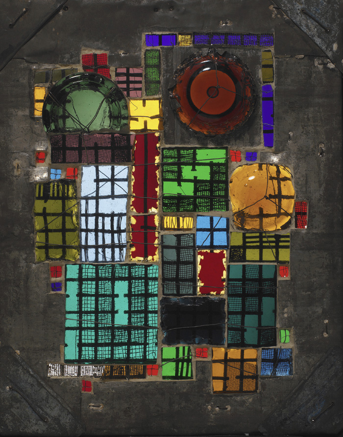
• Paul Klee's hand puppets look like they belong in the Burton exhibit. His drawings too- I really like "Puppentheater" and "Der Angler." It's interesting that with the recurring emphasis on basic forms and primary colors, that Klee is one of their most famous teachers. I always thought of him as stylistically different than that.
• I enjoy Kurt Schmidt's Form und Farborgel mit bewegenden Farbklängen- fascinating piece, a striped/painted wooden relief, a little like a maze [read the description] It is like experiencing the rising and setting sun, the progress of music- it is a piece that evolves in the movement of the viewer. Really fascinating.

• Schrammen's Maskot- dark, smooth wood, geometric shapes, quasi-robotic, a subtle joyfulness. A really cool piece, and indeed the mascot of a Bauhaus student.

objects in this gallery: carpet, cabinet, chairs, cradle, newspaper shelf.
([maybe delete this section] How many of these objects were actually used? Were they made to provoke, to be thought about- or for actual use? I have a feeling they were for use. At least some of them certainly were; they sold chairs. And surely they were more interested in uniting and crossing disciplines, rather than merely provoking and surprising with their objects, ala Duchamp. Anyway, I think it would be cool to know about the family that raised their baby in a Bauhaus cradle.)
A New Teacher: Laszlo Moholy-Nagy
• I love Josef Hartwig's chess set- holy crap they should sell these. Pieces shaped like the movement rules of the piece (the Knight shaped like an L, the Bishop an X.) Hartwig was the master craftsman in the Weimer Bauhaus wood-carving and sculpture workshops. The chess sets exemplify "an unqualified faith in the potential of pure logic and geometric abstraction to provide a visual language appropriate for a new, more rational world." Beauty, utility, and logic- three of the central traits of the Bauhaus really convey themselves to me in this set.

I like all the Kandinskys… Schwarze Form is cool. Kurt Schmidt's marionettes are pretty cool; the whole concept of the 'mechanical cabaret' is intriguing. All of the kitchenware looks like it could be sold in the Moma design store today. Gleaming, elegantly geometric. Modern was perfected 90 years ago.

The Move to Dessau
Now the Bauhaus is in a bigger, more thriving, more industrial city than sleepy Weimar…
• It's fascinating seeing Moholy-Nagy's photos of the Bauhaus artists. They're all so hip. So frozen in time. I really like Kandinsky's "Drawings for sixteen movements for Modest Mussorgsky's
Pictures at an Exhibition." Especially XVI: The Great Gate of Kiev. They're beautifully clean and geometric.

• I really like Moholy-Nagy's Constructions in Enamel, enamel gives a particular texture and look which I always find appealing (for instance, in Johns' work.)- wow, a factory produced these according to his specifications! One of the most fundamental contemporary art concepts I can think of, "the artist in the technological age as producer of ideas, not objects" was already in the place in the '20s. Sorry Hirst!
• Moholy-Nagy's Nickelplastik- clean, geometric, beautiful. The coil vibrates- much like a Miro work I saw last year. I love it. So exciting to see a work that is still alive!

objects in this gallery: lamps, chess sets, wall hangings, fruit bowl, liquor pitcher, tea caddies, ash trays, tea saucer, ink pot.
Art and Technology: A New Unity.
(I can't actually remember if this was the name of a gallery, or just part of a plaque, but it really does say it all.)
• I love this particular corner- the white circular table, two clean black chairs, before Kandinsky's "Auf Weis II" on a black wall- the adjacent wall blue, the floor gray. This would be such a cool room in an apartment. So clean and modern and stylish.
• Albers' Goldrosa and Upward- beautiful luminous glass. They are identical except color (dark pink and blue) and yet he made them individually, not on an assembly line. What a fascinating counterpoint to the Modern impulse to remove craftsmanship from the production of art.


• Light Prop for an Electric Stage (Moholy-Nagy) - the coolest god damn thing. An indescribable collection of gleaming geometric pieces, metal, glass, mirror, different shapes and textures, a wooden ball, projecting different shapes of lights, moving like a perpetual motion machine, and it looks like some sort of kitchenware Frankenstein, except beautiful- gleaming, categorically beautiful. What a fascinating object. The mind that makes this thing is just indescribably gifted.

• The collages in this room are pretty cool and crazy. So whimsical. Marianne Brandt, the main collagist on display- interestingly, collage wasn't even her main discipline. Just more evidence of the versatility of the Bauhaus artists. Our Unnerving City, the busiest, is my favorite. Helfen Sie Mit! reminds me of something Mark would make.
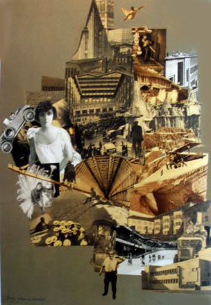
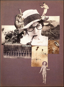
• I love Kandinsky's pictures, "Design for a ceramic tiled music room"… lovely texture, broad, flat backgrounds with intricate geometric objects within.
objects in this gallery: tables, lots of chairs, ceiling lights, writing desk, cabinet, kitchen table and chairs.
Hannes Meyer's Directorship
Gropius retired to focus on his architecture practice, and Hannes Meyer took over. He promoted well-designed affordable objects for mass production- a critique of luxury, a bit of a critique of the earlier years of the Bauhaus, their aesthetically flowery creations. His wikipedia page nicely illustrates the successes and controversies of his time as director.
• More photos of Bauhaus artists- Klee smoking a cigar, guys leaping in the air playing sports, a jazz band, a group of students hanging out. By 1928 the school was well known in Germany and beyond… Meyer promoted the school as "a tight knit community of teachers and students representing a new generation…" they "appealed directly to potential students through lively photographic images of a vibrant student body at work and play."
It's fascinating to look at a map and think of it as a living, breathing city… great artists, young and new creatives walked on those streets, they hung out, they explored the shops and restaurants and back alleys of the city, these lines on the paper.
objects in this gallery: ceiling lights, lamps, chairs, tables. Unpretentious, plain wooden furniture, smooth and simple, foldable, very much a precursor to Ikea.
Ludwig Mies Van Der Rohe and the Final Years of the Bauhaus
Hannes Meyer was dismissed by the right-wing Anhalt government for his Communist sympathies and affiliations (ah- makes sense, Mr. "low-cost unpretentious mass produced works for the common man.") The school focused more on architecture and interior design in its last years. In July 1933, in the face of political and economic pressure, the faculty dissolved the school by unanimous vote.
Kranz's Untitled Picture Series- a cool collection of water color frames… it reads like an animatic. Distinctly cinematic indeed- the frames sequentially relate to each other. So cool. Could be an acid trip or an imac screen saver.

Klee's Feuer Abends- a lovely work, nice and clean horizontal rectangles, dark greens, blues, grays, browns, violets, a small bur bright red square in the middle. Fire in the evening. Very pretty.

Klee is a texturally dazzling painter. I love the texture and the pastel palette of Hauptweg und Nebenwege.
The paintings in this gallery are rather nostalgic- Schlemmer's Bauhaus Stairway, painted shortly after the Dessau Bauhaus closed; Kandinsky's "Massiver Bau," a "souvenir of a friendship [Klee] and a home as he prepared to leave Dessau…" I really like this one. Sweet pink colors, the soft brown background. I Really liked Albers… "Skyscrapers," beautiful- black on white, white on black, black on honey gold. Beautiful, clean, geometric works.

objects in this gallery: chairs, architectural drawings.
Architectural drawings on one wall, chairs in the middle, and on the opposite wall, a series of paintings that seem to poignantly say farewell to the Bauhaus experience. Schlemmer's Bauhaus Stairway… they are moving upward. But they're also going away.

****general observations****
Fascinating to think of these are real, breathing, young, adventurous people… To think of their revolutionary objects, now pieces in a museum… the life blood still flows through them. This particular exhibit must be thought of in terms of the people and culture that produced the works.
• A recurring, perhaps the central, concept of the exhibit is the unity of practical use and aesthetic beauty. Chairs that are beautiful and simple, teapots and other kitchen ware, "wall hangers" (basically quilts.) Design is pretty central to the movement.
• What is it about geometry? What makes the simple, rational elegance of geometry the system that modern art returns to, again and again? The Cubists, Mondrian, The Bauhaus, the minimalists… "timeless modernity," a strange phrase, but that's what this gallery largely reminds me of. How is it that modern art was perfected 90 years ago, you know? Is my generation less adventurous? This gallery is a useful/funny/sad reminder that younger is not always more advanced, more progressive… elements of my great-great Grandfather's generation are responsible for cooler, more adventurous work than what this generation seems to have produced. To be fair I'm undervaluing my peers and overvaluing the Bauhaus (and without the benefit of retrospect to determine greatness), but there's certainly some truth in this.
• Again, it's cool imagining this in their moment, as a thriving community of artists. To think of students going to watch these marionette shows, or attending the play that Kandinsky staged, getting their photographs taken. It's a hip culture.
• It's interesting thinking of this as a community that the Nazis were determined to shut down. Their art was different, modern, rational, but how dangerous Were they, really? Was this really a politically/socially charged place, threatening to the Nazis, or were they just crazy bullies? I guess every indicator in the history of that movement would indicate the latter. What was it like for the students, after it ended? What happened to them, where did they go?
• A recurring theme- particularly of interest to Kandinsky, it seems- the interdisciplinary fusion of arts. Illustrations of Music, Art as Theatre, Light and Design as Film. Again and again, these fusions are discussed and explored and created.
• this artistic center is organized like a school- the whole thing reminds me a little of the theatre, actually. That said- what does the work of a mediocre Bauhaus student look like? What does bad art in this style look like, and how was it treated by the Bauhaus? I'm curious about how they treated inferior students- encouraging and welcome for the ride, or less so?
• My overall top favorites: Schmidt's Form und Farborgel, Hartwig's chess set, Maholy-Nagy's light machine, and Albers' colored glass grids.
Subscribe to:
Posts (Atom)